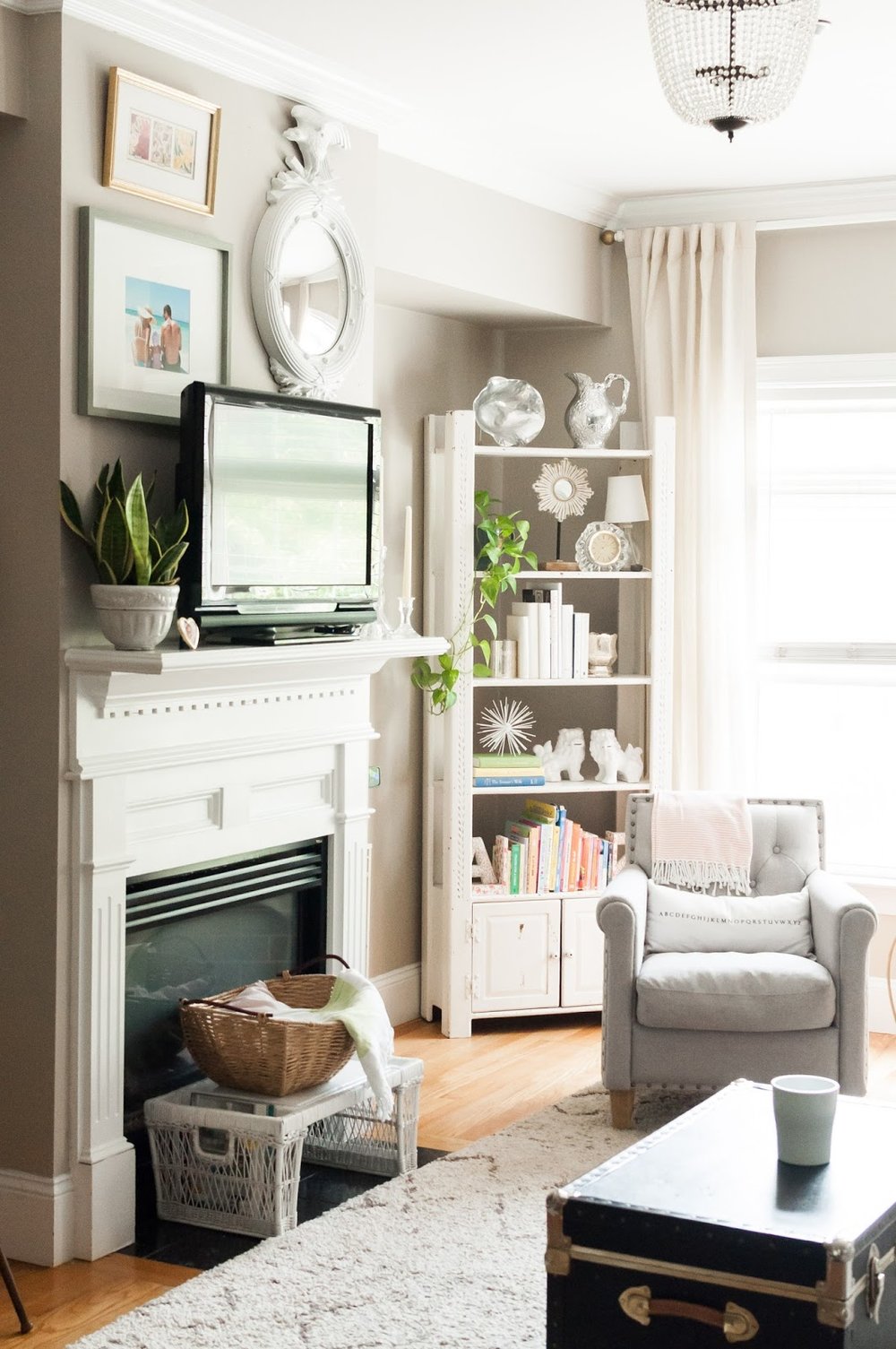
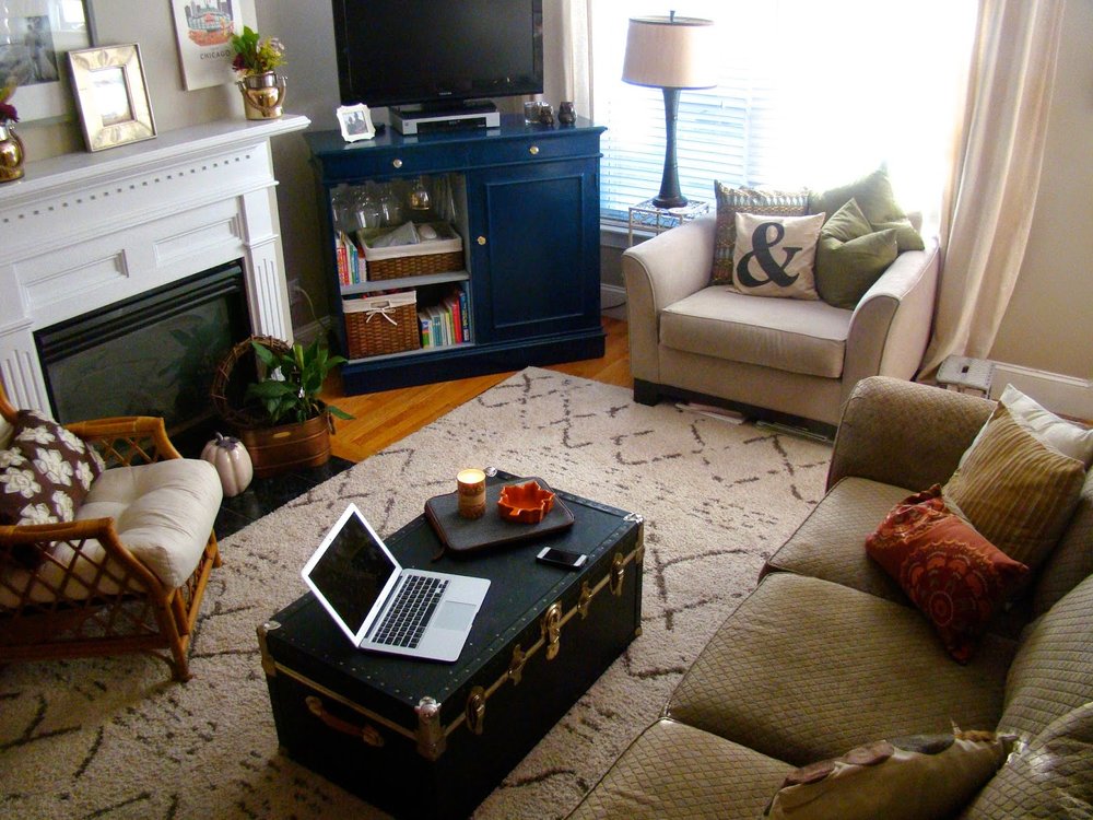
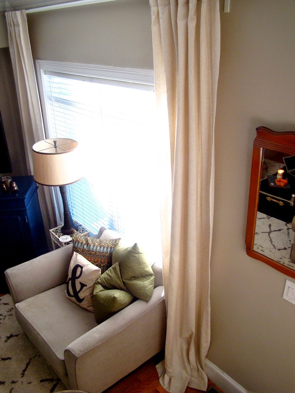
After our two week vacation on the cape, I returned home feeling refreshed and inspired. I wanted to channel all the sun and lightness from the summer into my home. It didn't take much - just some rearranging of all things white, adding some live greenery, and more reflective mirror action.
After a trip to T.J. Maxx and Marshall's, a climb into my attic and some shifting of throw pillows; my refresh was complete (for now, let's be honest). Nate Berkus suggests taking everything out of a space, and then putting it all back together when you are needing a refresher not a re-do. Even just moving a potted plant from the floor to the mantel can give it a whole new life! details below...
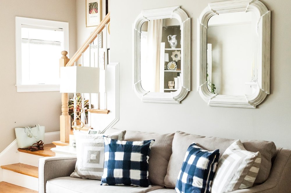
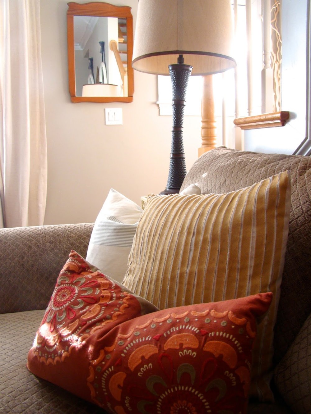
I replaced the large statement clock above the couch with two mirrors. The original plan was to find one long, large, rectangle mirror but when I spotted this pair at T.J. Maxx, I decided a pair would be more interesting but still give the same reflective effect desired. Three mirrors would be ideal, unfortunately a third wouldn't fit on the wall.
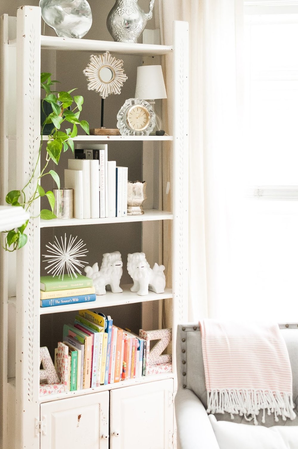
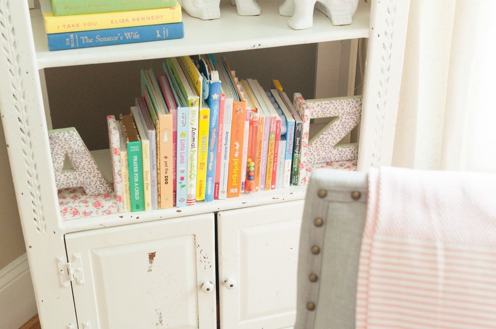
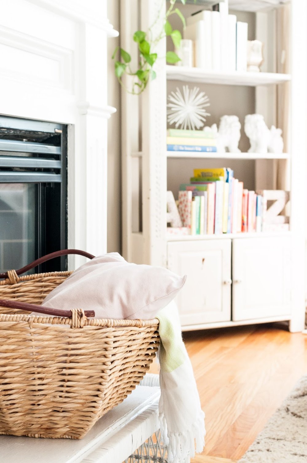
I've been having so much fun with this bookshelf ever since I moved it to the living room (read last year's update here). After studying Emily Henderson's instagram pictures and reading her new book - she is my new blogger/designer crush - I realized what my style was missing: greenery! Live plants to be more specific. I had them around the house in corners, but I've never displayed them before. When placed strategically, plants add immediate sophistication and beauty. I'm planning to add some interesting cacti asap.
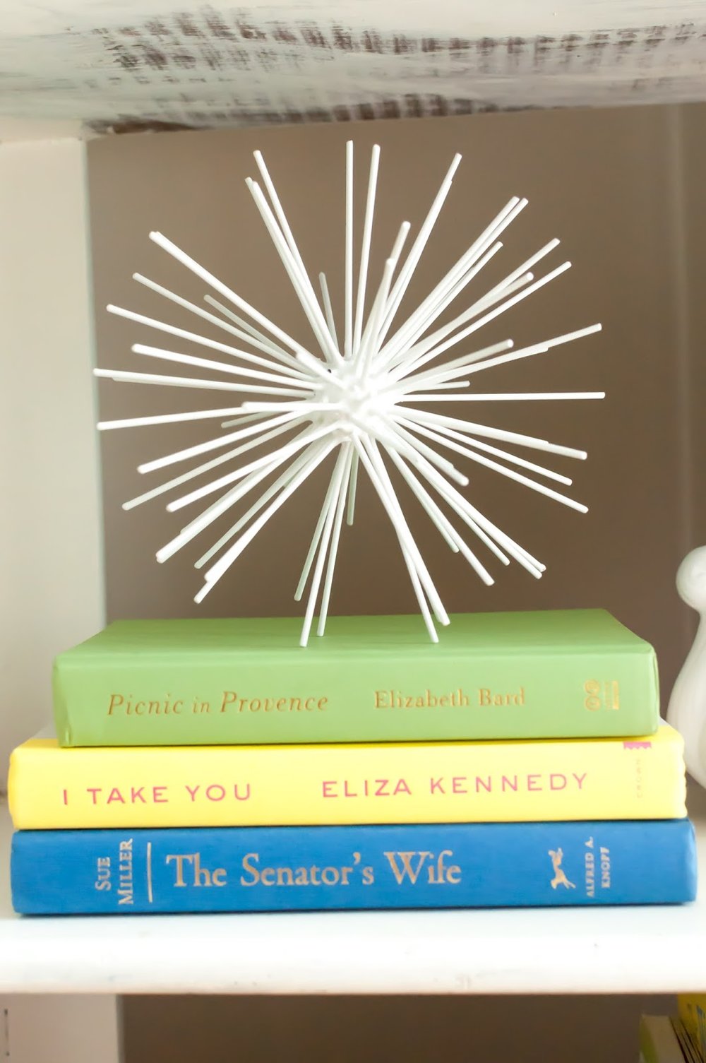
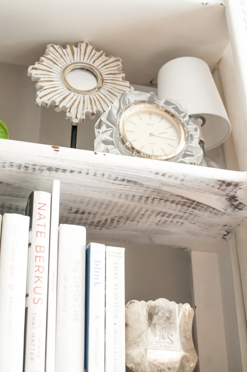
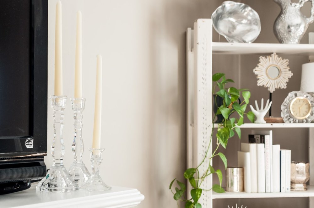
My new favorite thing is to take off a hardcover book's sleeve. So many books have unusable covers when styling but underneath you will find a beautiful book. When I go thrifting or to yard-sales, I'm constantly peeking behind old book sleeves hoping to find a color I can use in my home. I found all of these white books, pictured above, right here in the house! I scored the silver-plated vases during Paul's parents move. After some polishing, the silver came through brightly adding a nice balance to all the gold I tend to gravitate towards.
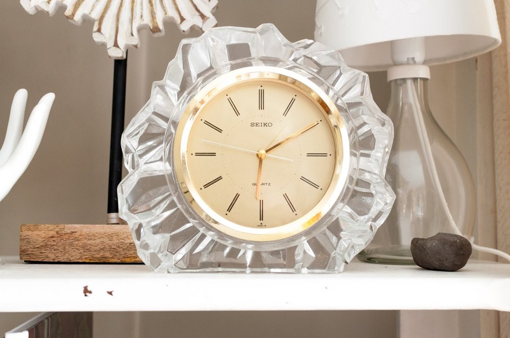
Your styled shelf, vignette, dresser, etc should always have personal elements to it. A picture is a great solution but heirloom pieces, travel souvenirs, or memorable gifts take the space to another level. Above is a clock I found in my mom's basement. It was a wedding gift to my parents from a close friend of my Dad's. While it isn't my mom's style anymore, it is certainly mine!! I love that I have a little piece of my parents story in my living room.
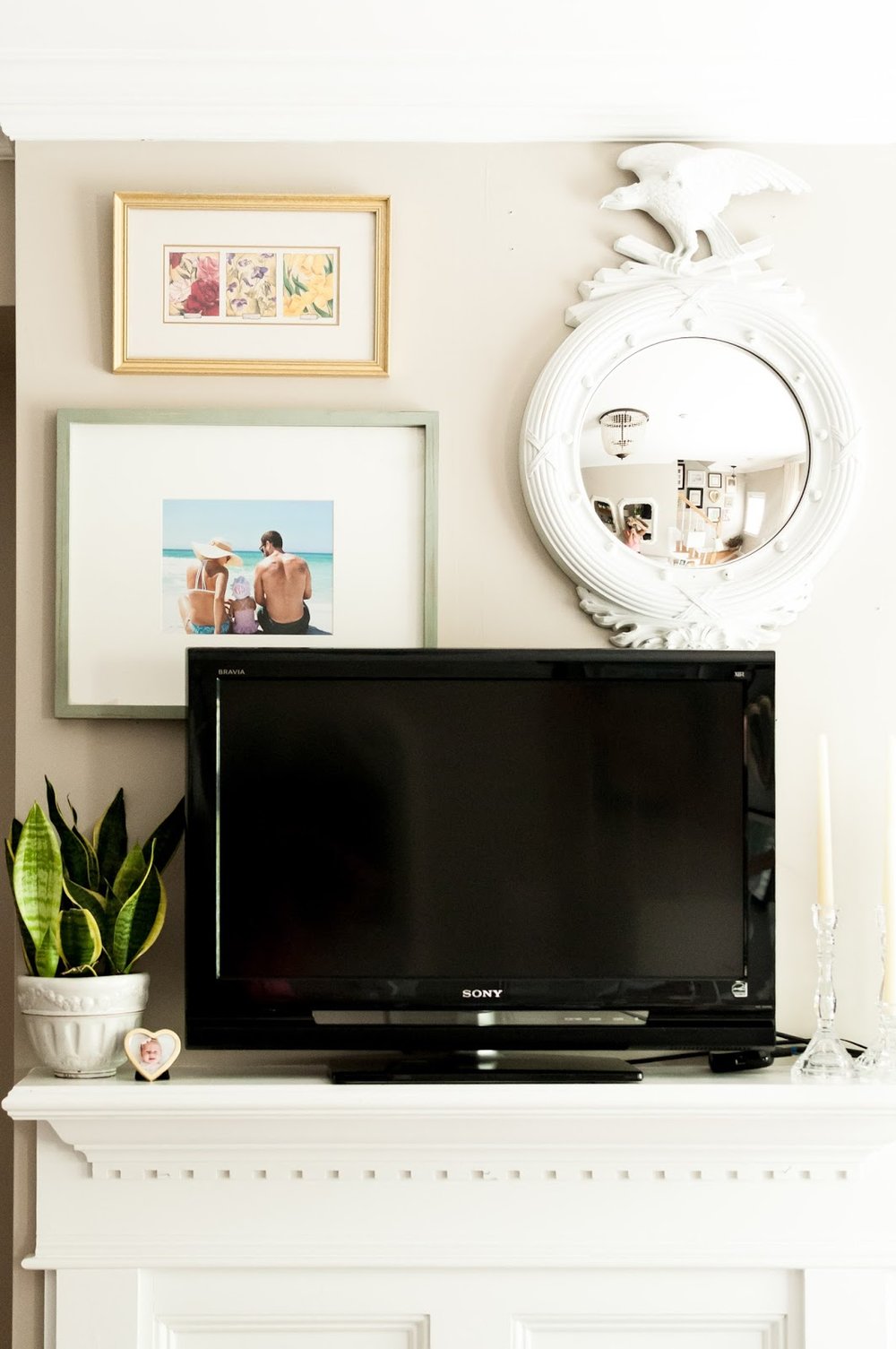
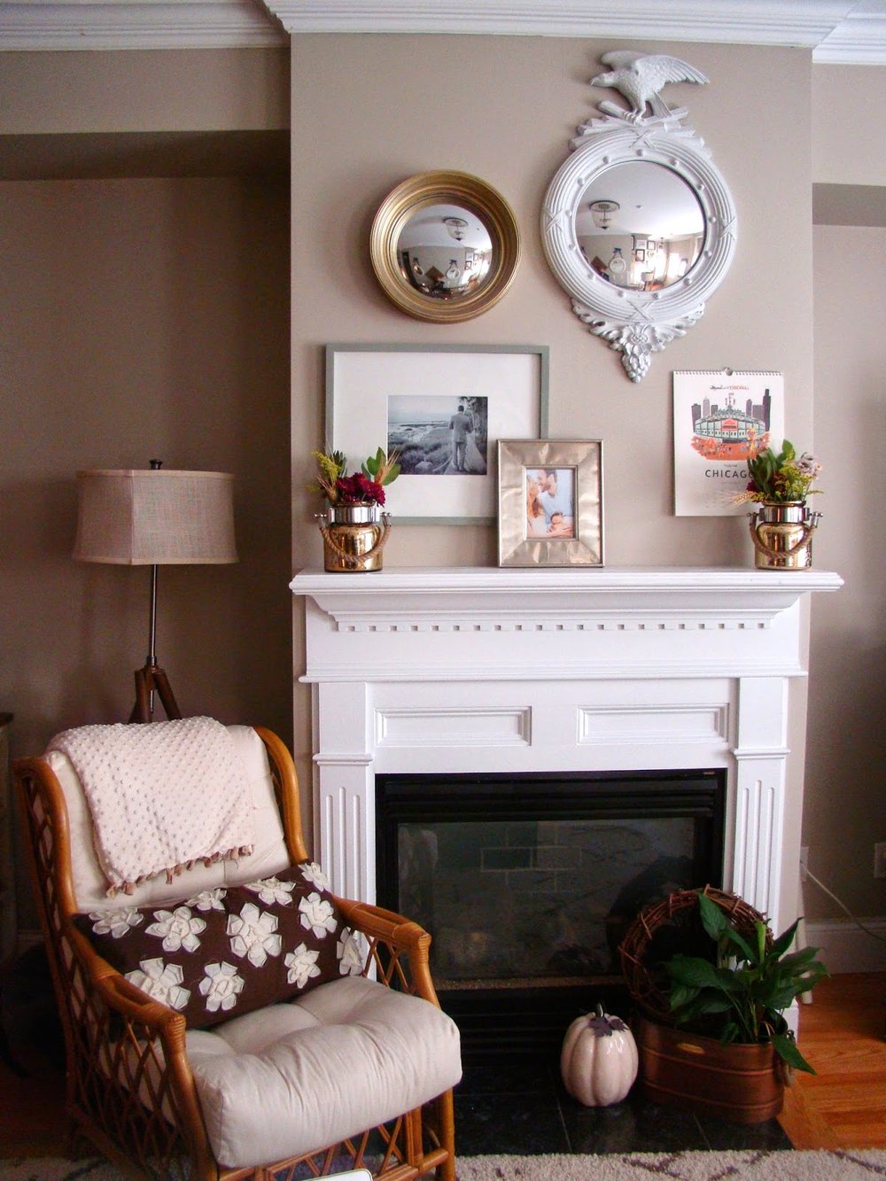
Last year, I moved the TV over the fire place. It makes so much sense in our little living room but gosh I missed the gallery above the mantel. Enter: TV gallery. I've seen a few bloggers doing this and thought it was a great solution, especially since we have the smallest flat screen ever. I chose large pieces that can be appreciated without being fully visible.
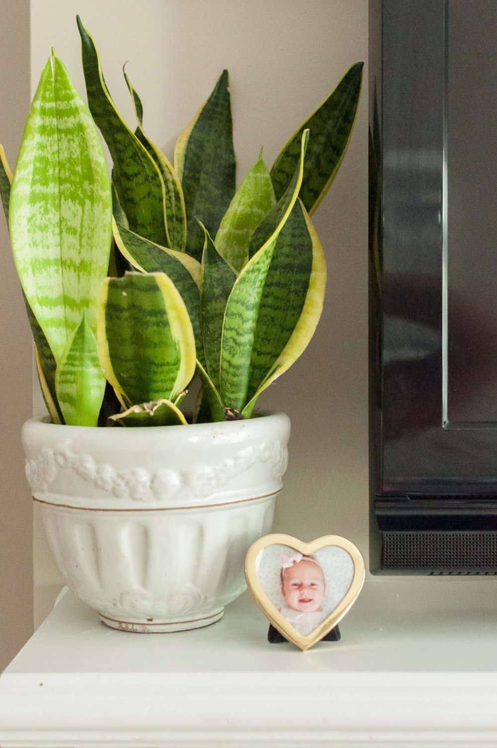
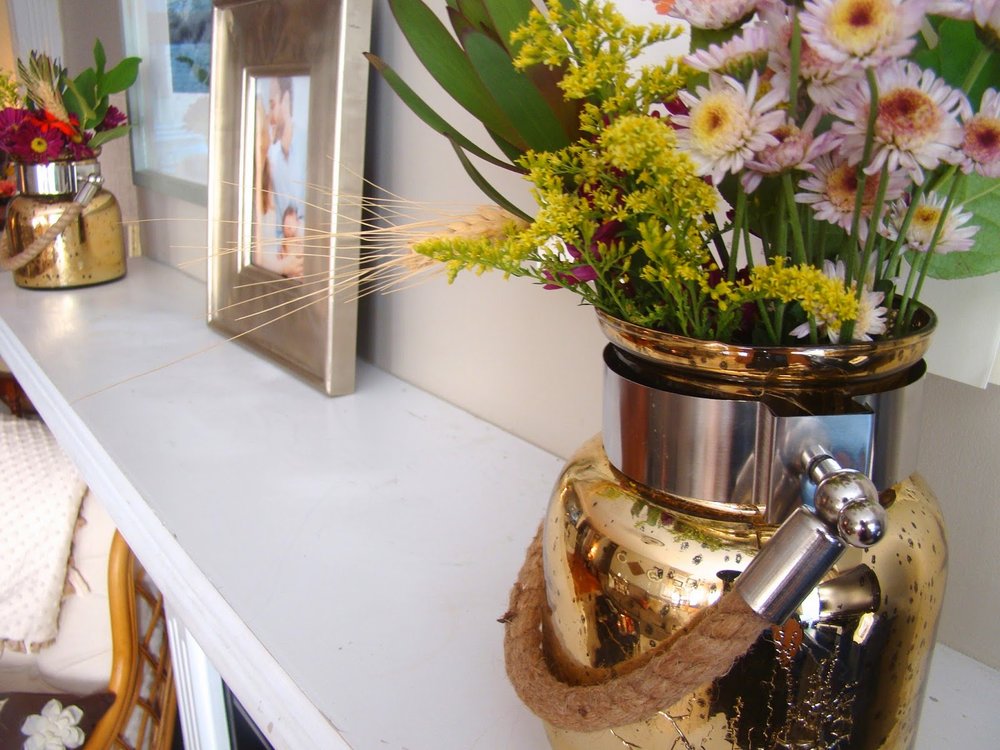
This plant was sitting in a corner, unappreciated. It was promoted and is thriving high up on our mantel. The sweet little frame is a thrift find and I will never replace the 4-month old picture of Roswelle.
These candle sticks were a wedding gift and were up in the attic because I used to think I could only use them during fancy dinners. But they are the PERFECT solution to balance out the other side of the mantel. Also, I love that they are crystal, which compliments the clock and is a nice change from the typical brass I see so much.
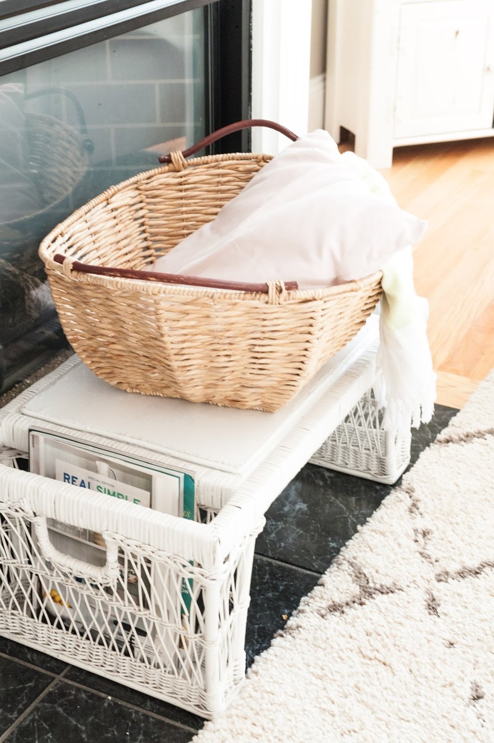
We use our gas fireplace every night in the winter, but in the warmer months it is just an eyesore. I picked up this white whicker breakfast tray on the side of the road two years ago. It has been in my guest room since then but was mostly getting in the way. It's the perfect height for in front of the fireplace and provides storage for current magazines and a basket full of throw pillows and blankets.
That's all y'all! Hope you enjoyed the tour and found some inspiration for your spaces!
Be sure to check back this week for newborn pictures of sweet baby boy, Declan Rock! (Instagram preview)
<3 Lauren
