Things I'm Lovin' - Toddler

Things I'm Lovin' - Toddler

1.

Blabla Knitted Pillows

: I've been a fan of Blabla knitted dolls since Roswelle was born. As she grows older, I'm looking for ways to add fun, intriguing pieces to her space while keeping it classic and appealing. The knitted cacti pillows fit the bill! Would be adorable in any playroom, toddler's teepee, or bed.

2.

Brew & Serve Wooden Coffee Maker:

 Does your toddler watch you make your coffee every morning? Does he/she ever want to help? Well now he/she really can! Adding this play set to your morning routine will make for merrier mornings. You can enjoy your real coffee while your little makes you a variety of freshly brewed concoctions.

3.

Kid Apron Set by the loveliest:

 This is a great gift for a toddler who loves to spend time in the kitchen (and would be a great pairing with item #2 above). The loveliest company really is just that, offering adorable bedding, quilts, mobiles, and wearables. I'll be revisiting this site again, I'm sure!

4.

Kid Made Modern Paint & Brushes:

 5pm can be a tricky time in our house, too late to head out and still a good amount of time to kill before bed. Recently, I've been setting Roswelle up to paint at the kitchen table while I prepare dinner. My favorite paint for her little toddler hands is the Kid Made Modern wide mouth/tip proof set paired with short, sturdy wooden paint brushes. I can walk away from the table while she is exercising her creativity for at least 20 minutes. And because a spill is inevitable, even with the best supplies, the paint is washable.

5.

Ikea Doll House/Wall Shelf:

 I really could do a whole list of Ikea toys I'm lovin' - they have some great classic, wooden toys available. This doll house is great because it mounts to the wall and can develop into a book shelf as your toddler grows older. My sister-in-law put craft paper/wrapping paper to the back walls, making it an even more festive and stylish doll house!

6.

Fred & Friends Dinner Winner Plate:

 Does your toddler fight eating dinner? yeah, mine too... I saw this plate in February's issue of Real Simple magazine and think it's worth a shot. The idea is to put meat, vegetables, etc along the way with a treat (cheerios, blueberries, chocolate - whatever that looks like for you) at the Finish Line!

7.

Gap Moccasin Fringe Sneakers:

 Roswelle was gifted these at Christmas and my goodness she gets so many compliments on them! People have stopped me to ask me where they are from - Gap, y'all! And they are still available for purchase. With velcro fastens and minimal soles, it's a great everyday shoe for her.

8.

Usborne Book of Things to Spot:

 Roswelle LOVES search and find books, so when a couple girlfriends started selling Usborne books, I was excited to purchase the "things to spot" books. The pictures have so many details providing numerous ways to quiz her aka "which one has spots, which one is the smallest, can you count all the ants." It is her favorite book at the moment!

9.

Chasing Paper Removable Wallpaper:

 I do love decorating Roswelle's room in a particular way (light colors, clutter free, super girly)...but I do think a child's room should reflect their tastes. This removable wall paper is good quality and actually is easy to remove (so I've read from other bloggers). You can start, mess up, and restart - sounds good to me! I would love to do an accent wall in Roswelle's room and let her pick out the paper (and by pick out, I mean select from the options I give her...control freak momma here!)

Things I'm Lovin' - Home

It's Tuesday! Which means another installment of Things I'm Lovin'. Today is all about the Home. Some items are primarily for decoration; however, most are things that have made my home life easier and more enjoyable.

Things I'm Lovin' - Home

1.

Oreck Steam Mop:

 All hail the STEAM MOP! A great alternative to the messy, dip & rinse yarn mop, or the questionable cleanliness of the swiffer wet-jet (which I have been using for years); the steam mop provides a deep down clean without the use of chemicals or detergents. After it's been used, simply pull off the cloth cover and toss in the washing machine. I use the mop all over the house - on the hardwood, the bathroom tile, and even the bathroom tub.

2.

Simple black frames:

 I'm partial to decorating with whites, grays, creams, and neutrals but I have been leaning into the idea of intentional dark colors to compliment all the lightness. I've found that the best way to add some much needed depth is through the clean lines of a simple, black frame. I'm planning to put 3 of these large square frames above our master bed. Now I just need to decide on what will go in them...

3.

Black & Decker Dust Buster: 

All I need to say is this dust buster

actually works

. It has a simple and sleek charging stand and is my go-to tool for the inevitable messes in the kitchen or after I blow dry my hair in the bathroom.

4.

Ceramic Match Holder:

 I don't own one personally, but I have gifted the ceramic match holder/striker after seeing it on multiple gift guides prior to Christmas. A great addition to any side table or bathroom vanity and removes the need for having matches next to the candle. If you order the match holder, don't forget to order "strike

anywhere

" matches off amazon.

5.

Dr. Bronner's Liquid Soap:

 I bought this for soap in the shower and after reading the back of the label listing all of the other uses, we have quickly started using it all over the house: Dish soap, tub/bathroom cleaning, and even a vegetable cleaner.

6.

King-Sized Throw:

 Believe it or not, throws are hard to find in king-size, or even queen size for that matter. That's why so often you will see them draped over the corners of larger beds in pictures. The king blanket I've linked isn't necessarily a throw, but it comes in a great pattern, multiple colors and is thin enough to be casually placed at the end of a bed. My mom also has a great tip - a twin sized quilt is the perfect size for the end of a King bed.

7.

Rifle Paper Wall Calendar: 

My favorite way to kick off the new year is with a Rifle Paper Calendar! The notable artwork each month is both uplifting and fitting to the mood I feel with each month's weather and festivities.

8.

Marble Oval Cutting Board:

 I've used this board over and over again. Photographing food; a tray for flower, matches, and a candle; a pretty addition to any bathroom vanity; or even for its intended use as a cheese tray or hummus platter.

9.

Everyday Co Linen Dinner Napkins: 

A local company born in Boston, the linen napkins are meant for everyday use in replace of paper napkins. Many of us save such a napkin for special occasions or dinners, but wouldn't it be nice to treat every meal, every day, as such? I have yet to buy myself a set, it's on my list, but have gifted the dinner napkins three times!

10.

Bonavita Coffee Maker:

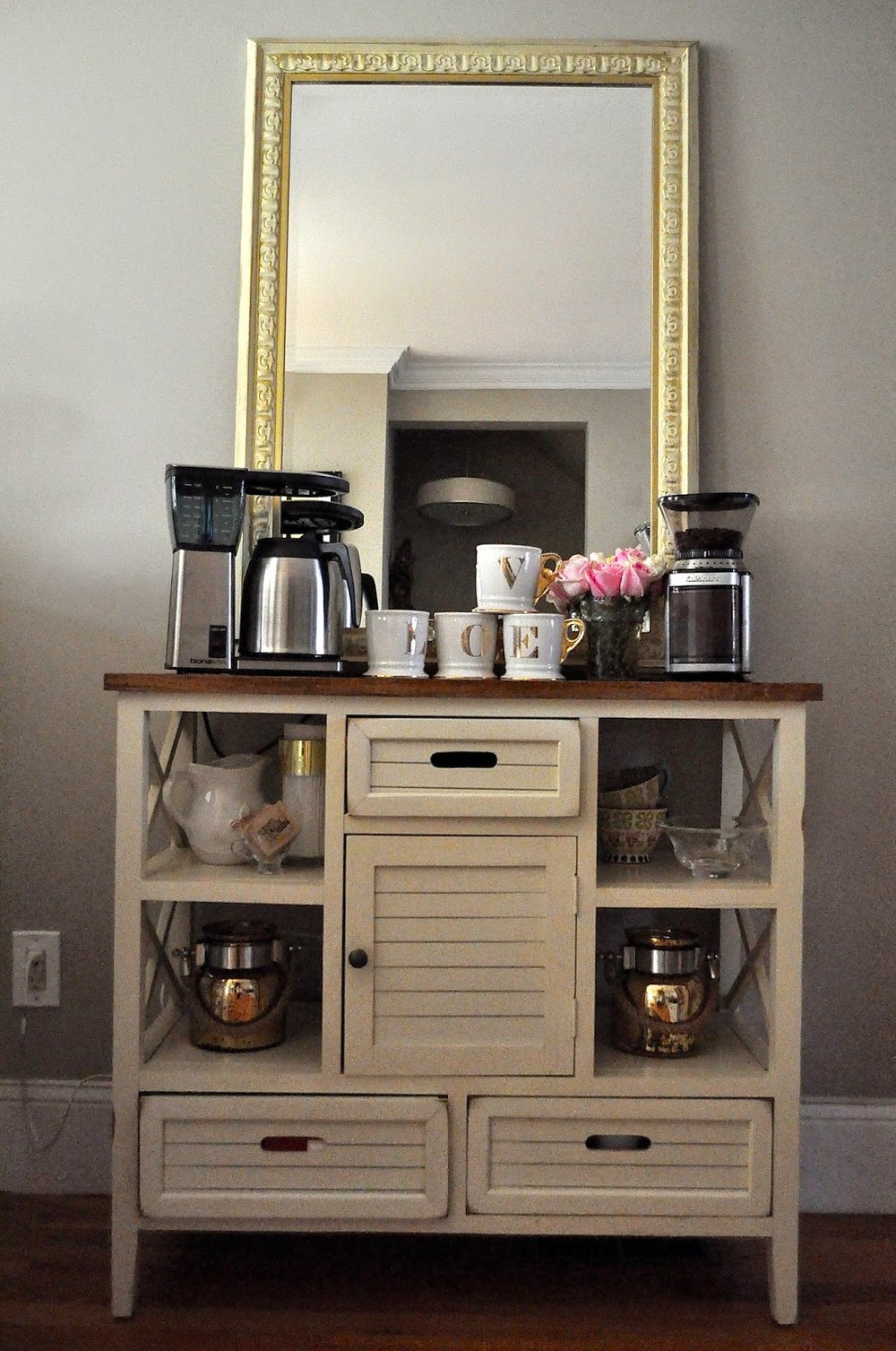
  My favorite coffee maker. I prefer this sleeker look to some of the other bulkier options out there. It's also available in white!

11.

Bodum Milk Frother:

 Not something I use every day, but you could! It always fun to have something extra special when having girlfriends or family over to the house. I was gifted this milk frother by my sister-in-law; it adds a bit of elegance to my coffee bar and is a fun addition to offer with coffee!

12.

African Market Basket:

 Baskets have become something I use everyday - a place for fruit & vegetables, on the stairs for odds and ends, holding towels in the linen closet, or a place to gather throw blankets in the living room. A basket makes any collection of clutter look intentional, even stylish! This specific type of basket, an African Market Basket, with a giving bowl and a leather bound handle, is something I'm currently seeking. I've been seeing them pop up all over blogs and even spotted one in this month's Real Simple Magazine.  

I've loved putting these lists together so much that I'm currently planning to write a 4th installment: Things I'm Lovin' - Toddler Life!

Roswelle's Room - A Toddler Update


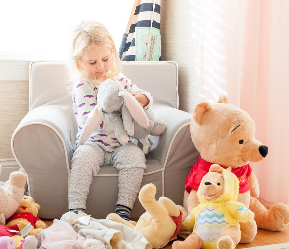
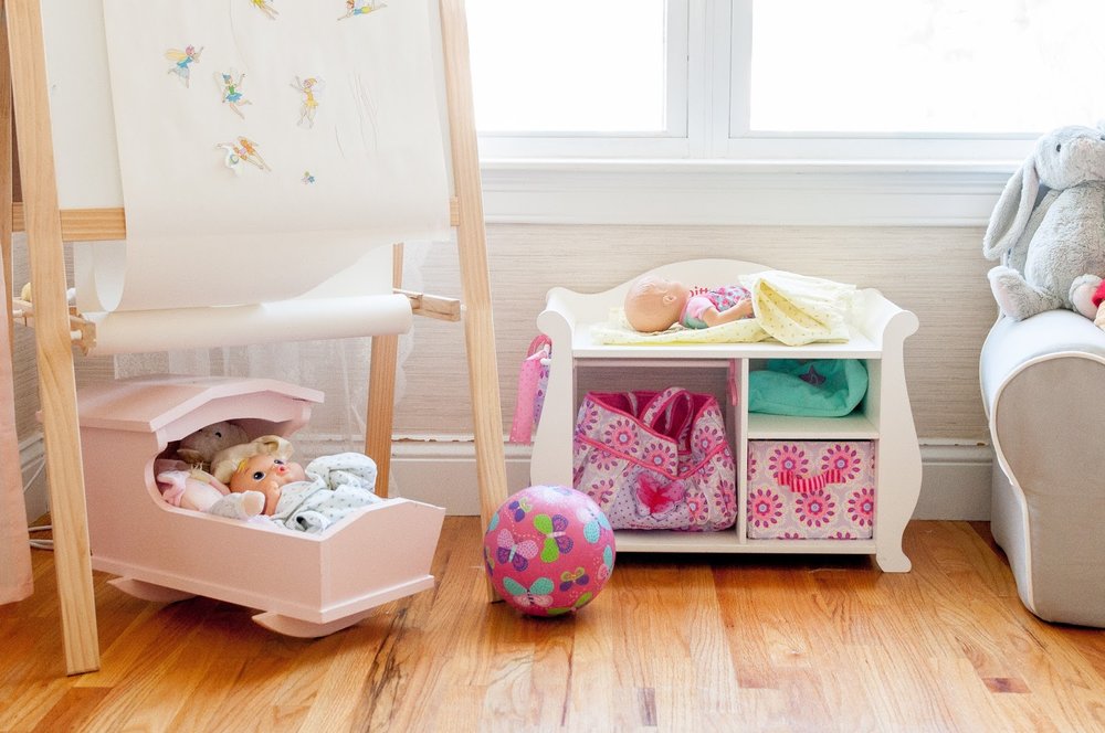
I realized the other day that I rarely photograph or post on Roswelle’s room. The last full highlight of it was over 2 ½ years ago (which you can read here) when it was barely used – she wasn’t even sleeping in there yet! She is now a full-time sleeper in there…and it's time for a dedicated post.

Speaking of sleep, Roswelle is still in her crib and we don’t plan to move her out of it until a) she grows out of it b) she starts to climb out of it or c) another baby is ready to sleep in it. That could be tomorrow night or a year away, I have a feeling it will be somewhere in between. Also, I moved the rocking chair into our bedroom to lend more space for age appropriate toys. While she has her favorites, the drawing/sticker board and her books, she still visits her picnic table and baby changing station enough for me leave them be.

A toddler room can be tricky to decorate because their interests change rather quickly. Choosing simple staple items like a bookshelf, baskets, an easel, and a table with chairs seems to work well. I update all of those with current interests, toys, and activities throughout the year while being able to keep the room aesthetically pleasing. Of course I wanted a play kitchen, doll-house, and even a teepee (which is currently folded up in a corner) but there was no room for them and they didn’t offer enough flexibility to be placed in her room. So for now, she will have to wait to go to grandmas house to play with those items – as they both have them waiting for her!

I’ve found that children rooms are the quickest to become cluttered. Memorabilia, old crafts, clothes that are too small, and old, un-used toys all start to crowd corners, drawers, and shelves. It takes a lot out of me to update her room every 6 months, both nostalgia and a slight bit of sadness make it tough to either store, give away, or toss those items. But in the end I feel better after the room has been updated for her level of development and age.

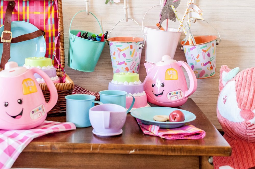
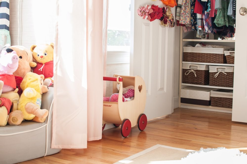
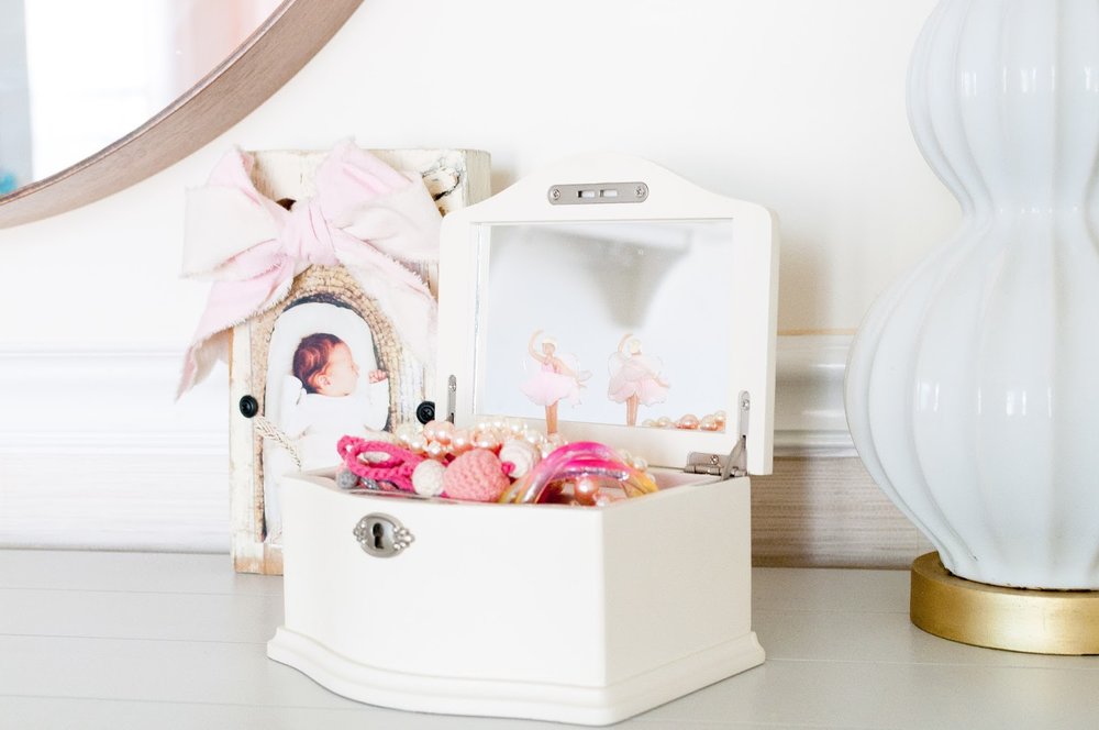
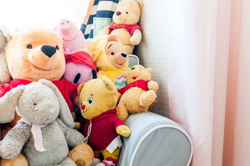
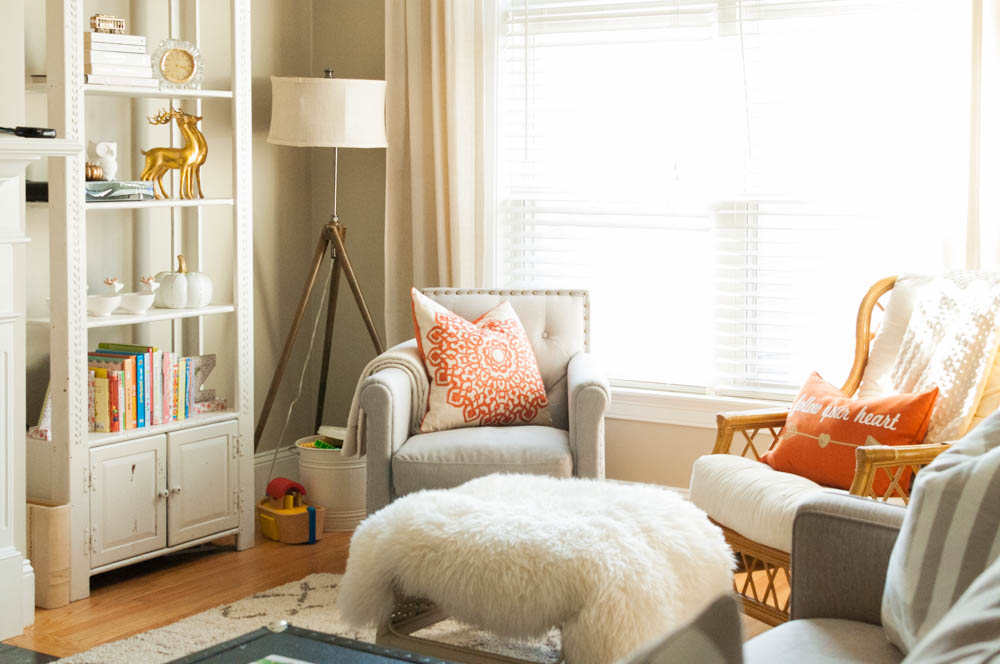
Below are some shots of her room I took the other day. I love when she and I just spend time together in there. The room gets great sunlight and I find it incredibly peaceful. And each visit she finds something that intrigues her all over again. 
{the look of curiosity!}
 
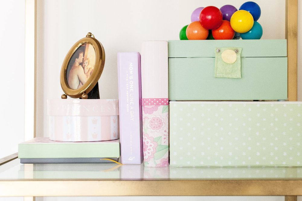
{you know how much I love to style and her space isn't excluded}
{some new and old items make for a great shelfie - that is a picture of my dad and I}

Living Room Update: August 2016

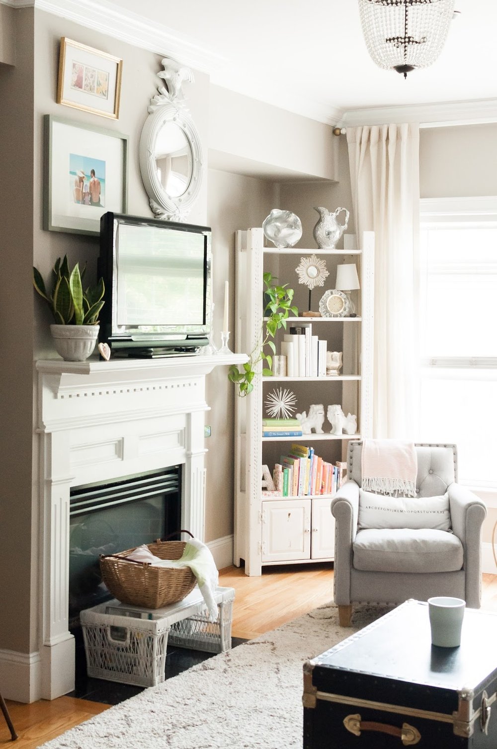
After our two week vacation on the cape, I returned home feeling refreshed and inspired. I wanted to channel all the sun and lightness from the summer into my home. It didn't take much - just some rearranging of all things white, adding some live greenery, and more reflective mirror action.

After a trip to T.J. Maxx and Marshall's, a climb into my attic and some shifting of throw pillows; my refresh was complete (for now, let's be honest). Nate Berkus suggests taking everything out of a space, and then putting it all back together when you are needing a refresher not a re-do. Even just moving a potted plant from the floor to the mantel can give it a whole new life! details below...
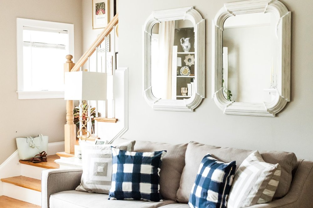
I replaced the large statement clock above the couch with two mirrors. The original plan was to find one long, large, rectangle mirror but when I spotted this pair at T.J. Maxx, I decided a pair would be more interesting but still give the same reflective effect desired. Three mirrors would be ideal, unfortunately a third wouldn't fit on the wall.


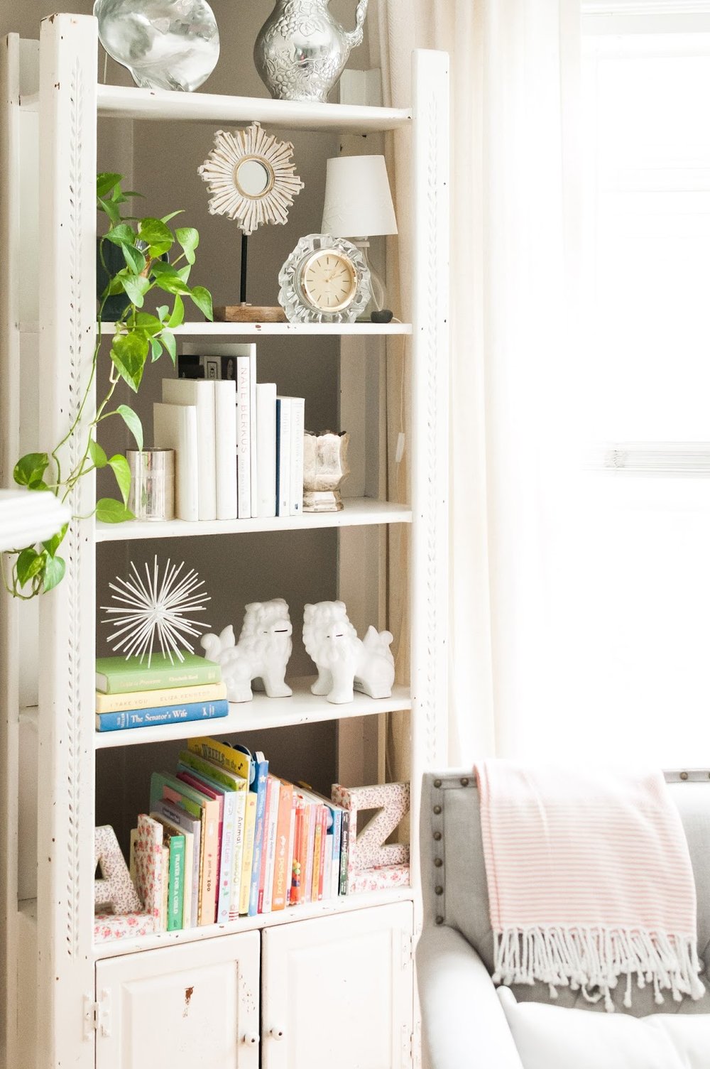
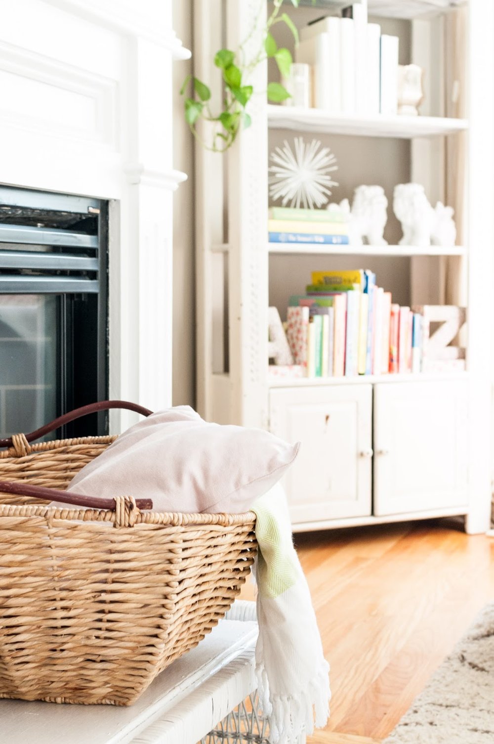
I've been having so much fun with this bookshelf ever since I moved it to the living room (read last year's update here). After studying Emily Henderson's instagram pictures and reading her new book - she is my new blogger/designer crush - I realized what my style was missing: greenery! Live plants to be more specific. I had them around the house in corners, but I've never displayed them before. When placed strategically, plants add immediate sophistication and beauty. I'm planning to add some interesting cacti asap.
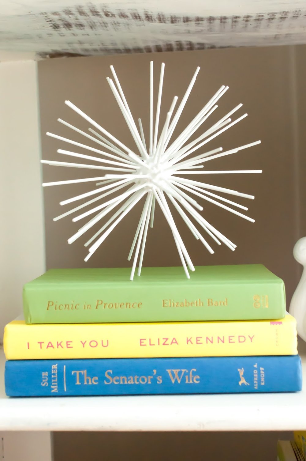
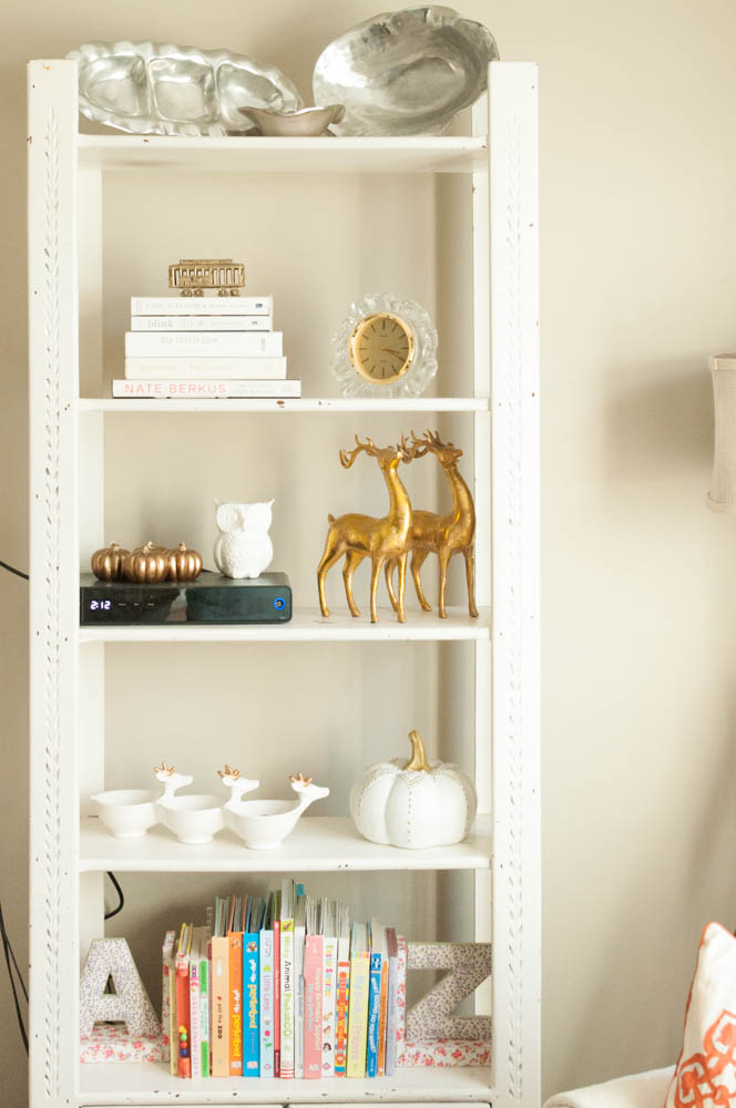
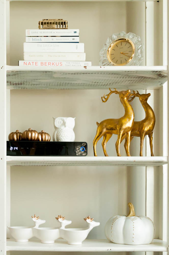
My new favorite thing is to take off a hardcover book's sleeve. So many books have unusable covers when styling but underneath you will find a beautiful book. When I go thrifting or to yard-sales, I'm constantly peeking behind old book sleeves hoping to find a color I can use in my home. I found all of these white books, pictured above, right here in the house! I scored the silver-plated vases during Paul's parents move. After some polishing, the silver came through brightly adding a nice balance to all the gold I tend to gravitate towards.

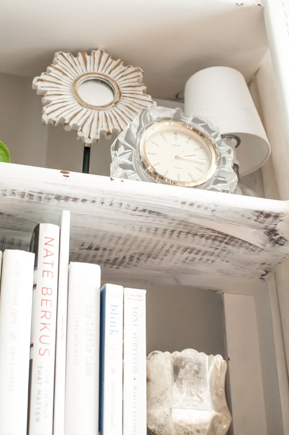
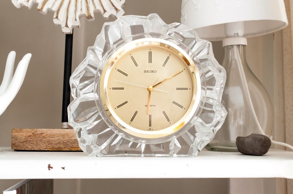
Your styled shelf, vignette, dresser, etc should always have personal elements to it. A picture is a great solution but heirloom pieces, travel souvenirs, or memorable gifts take the space to another level. Above is a clock I found in my mom's basement. It was a wedding gift to my parents from a close friend of my Dad's. While it isn't my mom's style anymore, it is certainly mine!! I love that I have a little piece of my parents story in my living room.
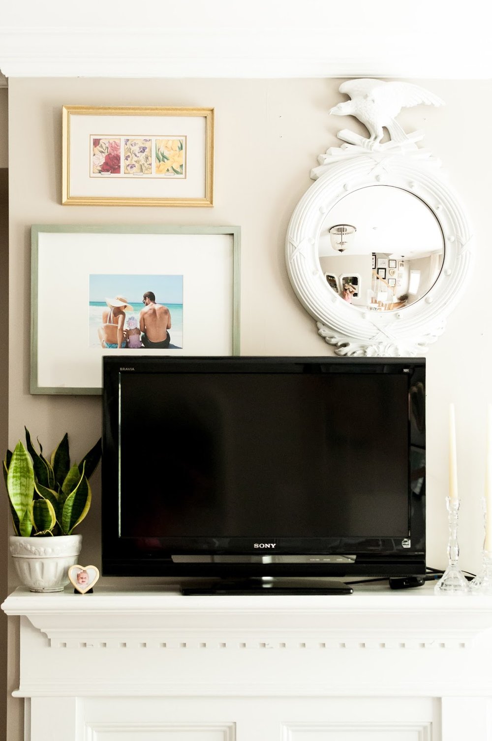
Last year, I moved the TV over the fire place. It makes so much sense in our little living room but gosh I missed the gallery above the mantel. Enter: TV gallery. I've seen a few bloggers doing this and thought it was a great solution, especially since we have the smallest flat screen ever. I chose large pieces that can be appreciated without being fully visible.

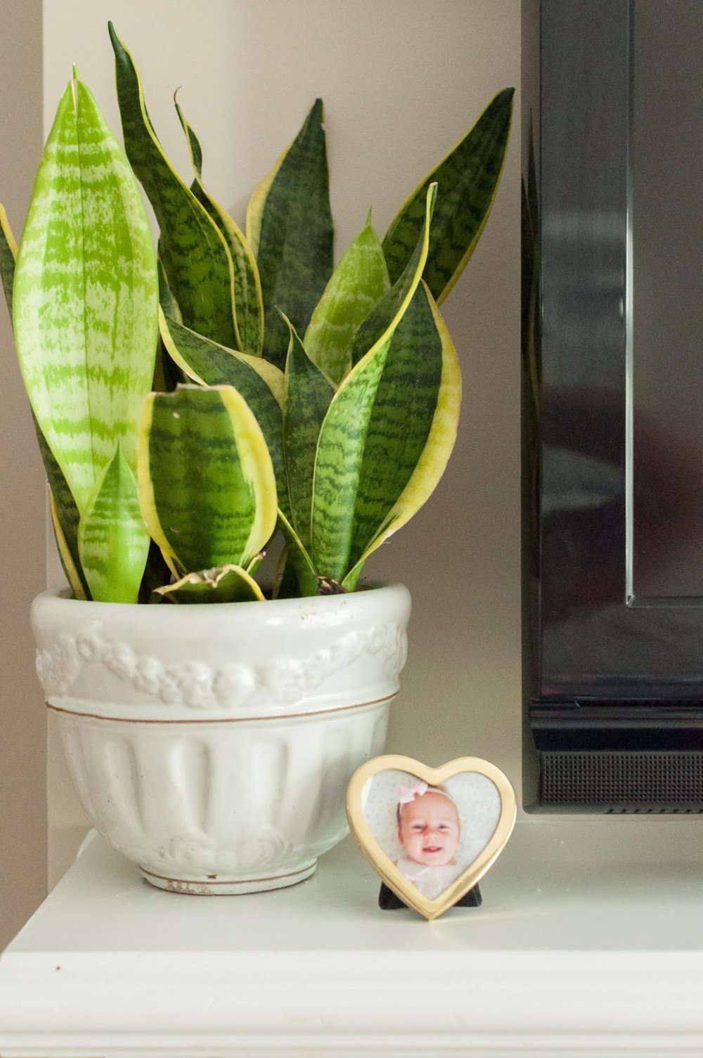
This plant was sitting in a corner, unappreciated. It was promoted and is thriving high up on our mantel. The sweet little frame is a thrift find and I will never replace the 4-month old picture of Roswelle.
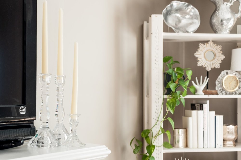
These candle sticks were a wedding gift and were up in the attic because I used to think I could only use them during fancy dinners. But they are the PERFECT solution to balance out the other side of the mantel. Also, I love that they are crystal, which compliments the clock and is a nice change from the typical brass I see so much.
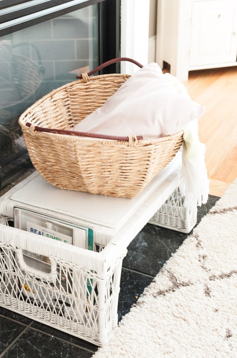
We use our gas fireplace every night in the winter, but in the warmer months it is just an eyesore. I picked up this white whicker breakfast tray on the side of the road two years ago. It has been in my guest room since then but was mostly getting in the way. It's the perfect height for in front of the fireplace and provides storage for current magazines and a basket full of throw pillows and blankets. 

That's all y'all! Hope you enjoyed the tour and found some inspiration for your spaces! 

Be sure to check back this week for newborn pictures of sweet baby boy, Declan Rock! (Instagram preview)


<3 Lauren

Living Room Update: Fall 2015


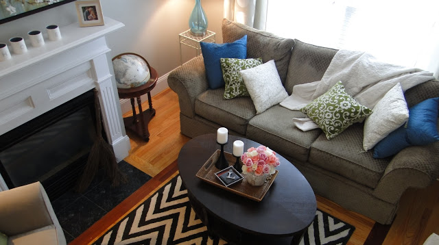
I did it. I got rid of the big blue buffet that was our TV stand/toy storage for 3+ years.  As my friend said, it was taking more than it was giving. And what it was taking was space. Living in the city, every inch of our home is important and valuable real estate which should be used strategically. I fought placing the TV over the mantel for years, but alas it just makes too much sense not to have it centered in our living room on wall space.  

I love rearranging; so one day when Roswelle was being quite laid back, I decided to get to it.  Below are the details of the change up (and a few before pictures too!).  

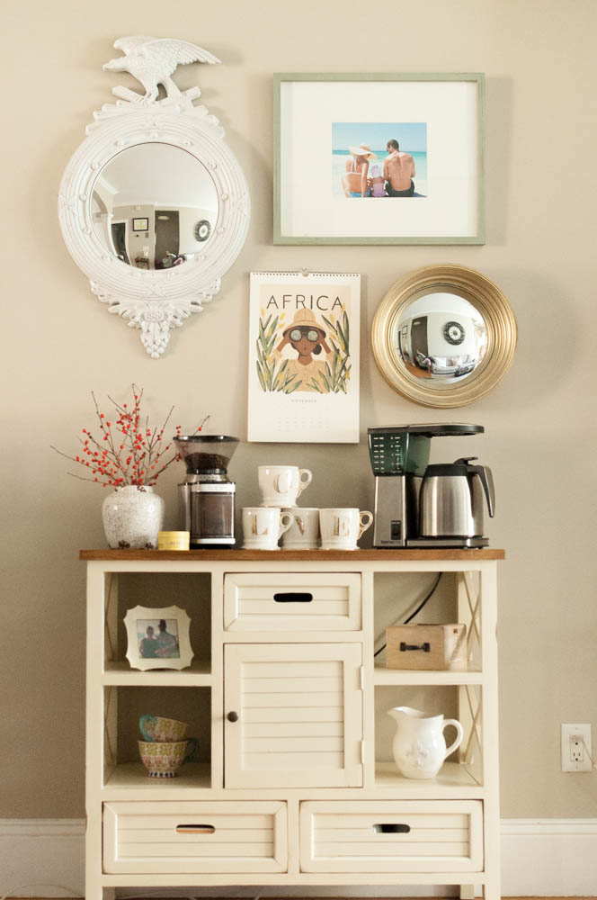
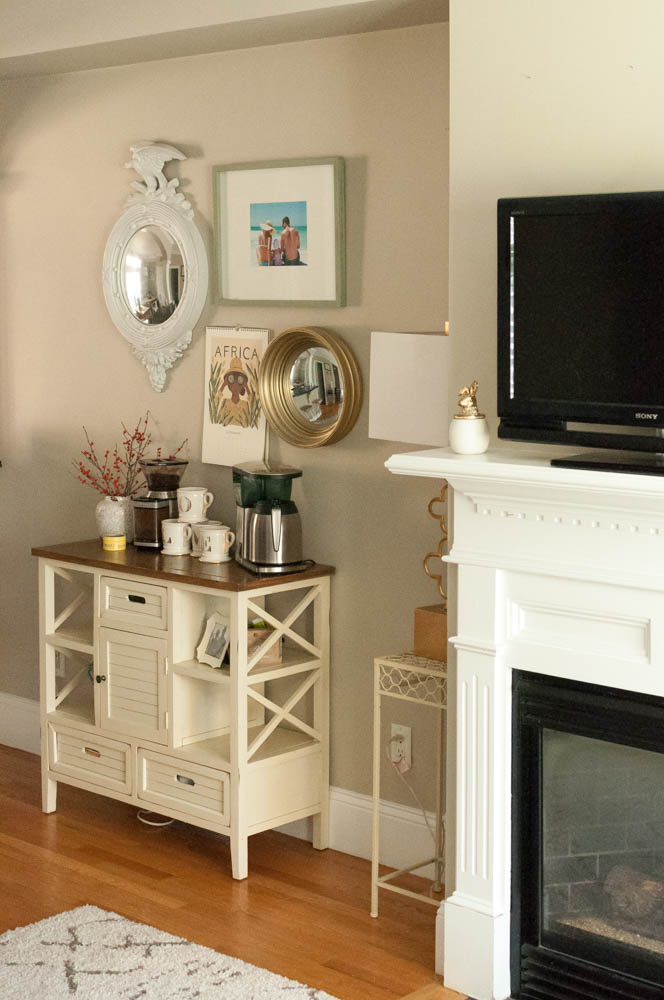
I loved my little gallery above the mantel but it also looks quite nice over my coffee bar.

Before:

We've had it set up like this for about a month now, and Paul and I both really love it.  btw...I read that you are supposed to feel your home with only things that mean something to you, and that you really love.  Well....I really love HomeGoods I guess, because my house is furnished with HomeGoods purchases!
{Below, circa 2012 - when I first moved in!}
{Fall 2014}


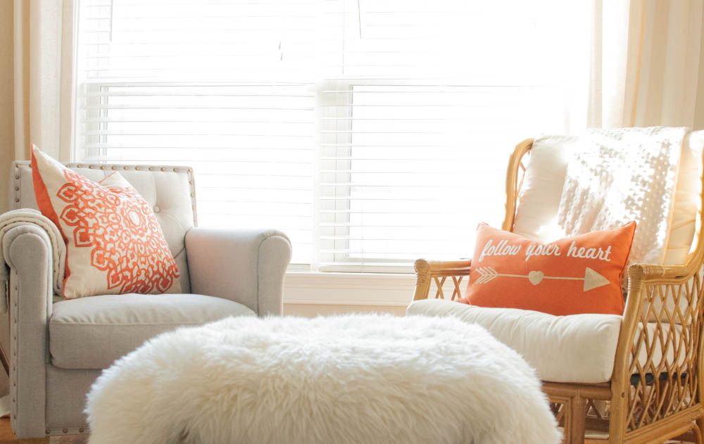
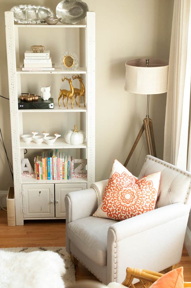
The cords will be hidden once the TV is actually mounted.  I found this chair on theGoods app and quickly went to the store to purchase. I love how deep it is - I can curl my legs up in it when I have my morning coffee by the window. And it's a great place to read Roswelle books that she selects. It's my new favorite spot.  
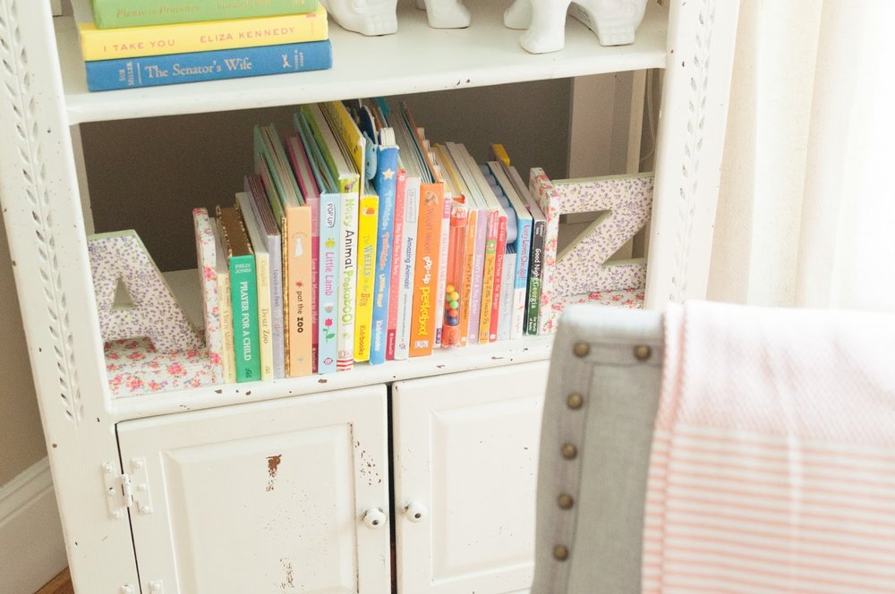
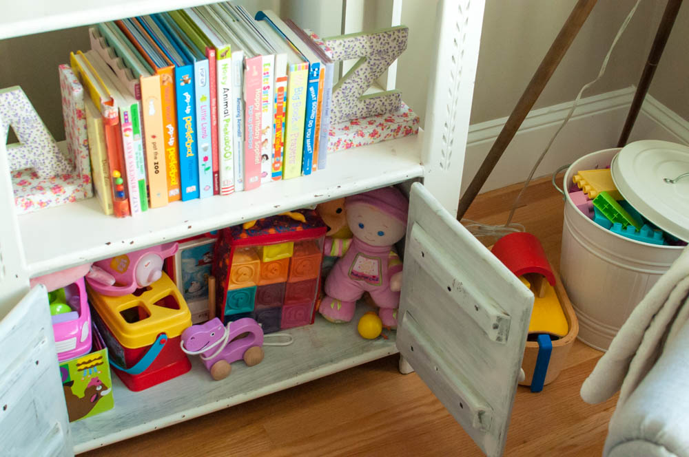
This bookcase was my grandmothers. And maybe her mothers before that? It's been with me through high school, my apartment in college, Atlanta, and the Northend...and finally it holds my daughters toys!
{a nice little blend of the Thanksgiving and Christmas Holidays}


5 Steps to Customize Your Interiors

I've had so much fun decorating our home over the past 3 years.  I moved in to Paul's bachelor pad when we got married and immediately started changing things up by adding lamps, throw pillows, and rearranging furniture.  I have learned so much about my design style, which is still evolving, but I'm honing in on "pretty+practical". Thankfully, Paul gives me 99% of decision making power when it comes to decorating and styling our home and in return I try to only add a little pink to each room ;) (and he also gets his garage gym, of course)

I thought I would share 5 tips to customizing your home without blowing your budget or hiring a designer.  I've learned these tricks from reading numerous blog posts, studying Pinterest pictures, and the best way: trial & error. 

1 // Don't buy bedding out of a bag, and if you do, don't use it all on the same bed! 
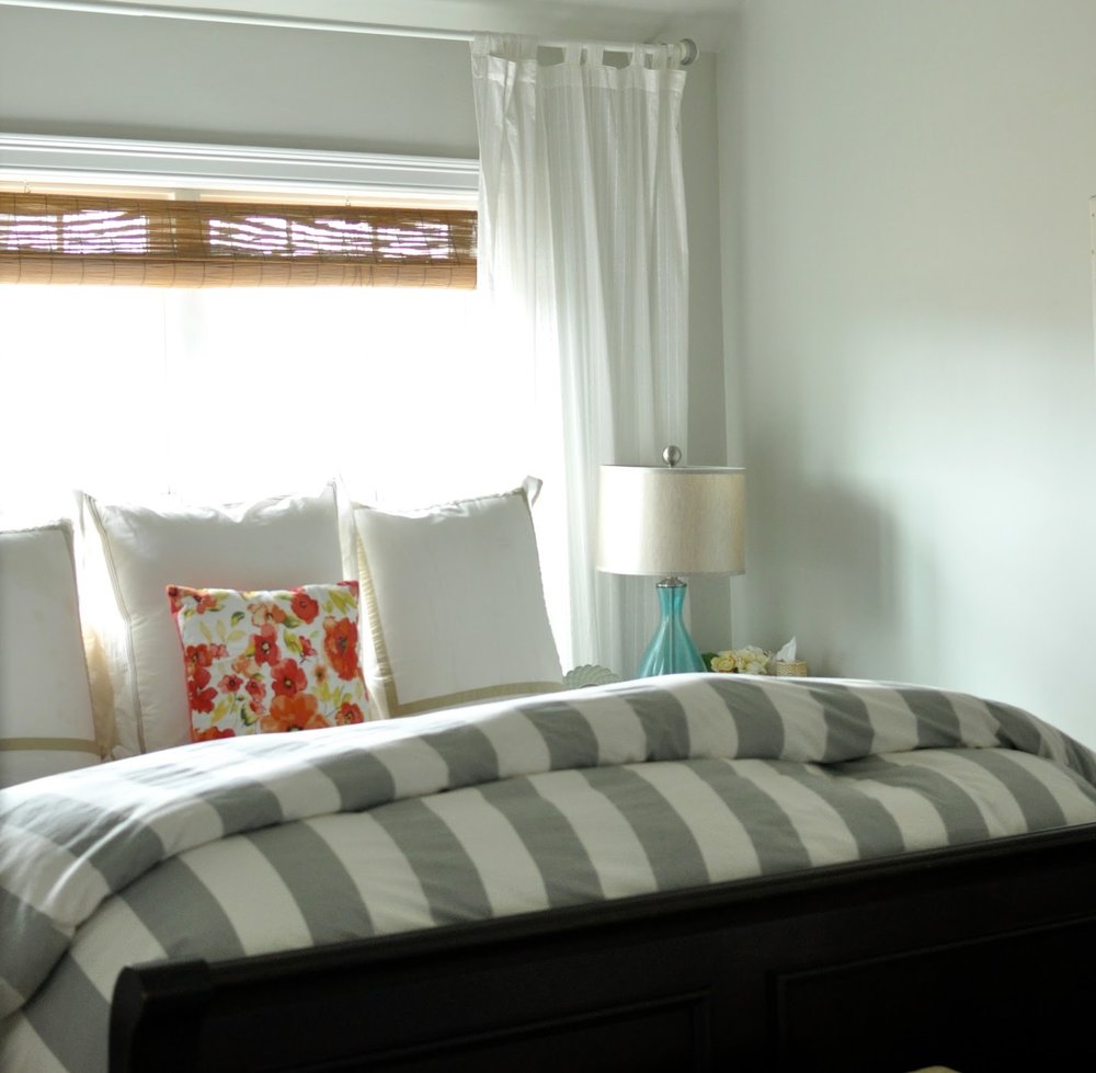
I've walked into Bed, Bath & Beyond/HomeGoods/Macy's and loved their bed sets, but I resist the temptation to buy the entire set for my bedroom!!  If you love the comforter, of course use it, but does it come with matching pillow shams and throw pillows?  If yes, then definitely use the pillows/shams in another room - even the living room!  Chances are that you have similar colors throughout the rest of your house. Switching up the designers and brands of your bedding will make it look customized and much more stylish. 


2 // Add one unexpected item when styling shelves.  
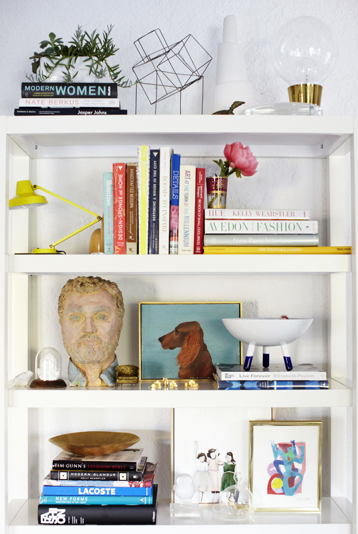
Emily Henderson's bookshelf below has a lot of unexpected items and I absolutely love it.  It's so interesting and beautiful and I need to go redo my bookshelf in my bedroom ASAP.  The sculpture, the miniature monopoly pieces, the little desk lamp, the huge light bulb? I could study this picture for a while. I suggest starting out small by selecting one piece in your house that has a lot of meaning to you (or maybe no meaning but you think it's awesome) and go stick it on a shelf where it doesn't "belong." You might be surprised how much you love it.  


3 // Place non-kitchen furniture in your kitchen.

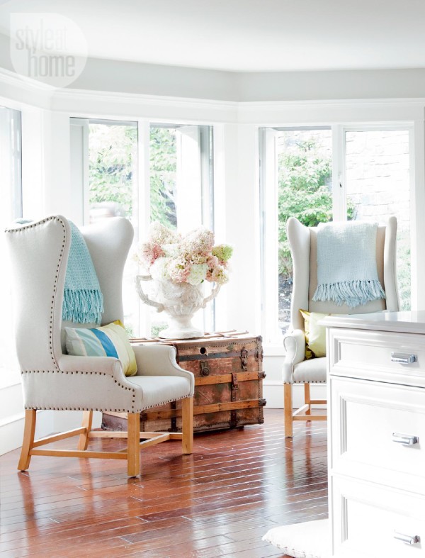
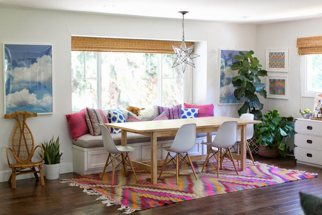
For instance, use an actual dresser to store your dinnerware, have a lamp on your countertop, or even a family heirloom grandfather clock in the corner next to your refrigerator. I love this breakfast nook in designer Jillian Harris's home which overlooks her kitchen, pictured below. Look around your home, there may be furniture that would serve your kitchen well!


4 // Use items in unintended ways.

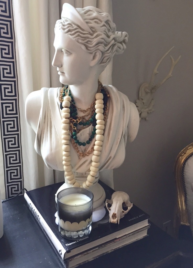
I love using my decorative antler piece as a bangle holder.  Sometimes practicality needs to be pushed to the side to let creativity have the spotlight. Wooden wine boxes can become storage on walls, plates can become pieces of art, or a room divider can be a headboard! 


5 // Love what you love
The biggest advice I have is to embrace your own style, because that is what looks best on you (and around you)! Designer Erin Gates still says how much she loves her inexpensive "Lady of the Bar" and the skull she found in her backyard! If you need help figuring out a color scheme for your guest bedroom, go look in your closet to see what you gravitate towards.  If you love a side table for no other reason than it makes your heart jump a little, you should buy it! It doesn't have to be perfect, it should just be "you". Learn  to love the saying "this looks like you" - as it may just mean you found your style :) 


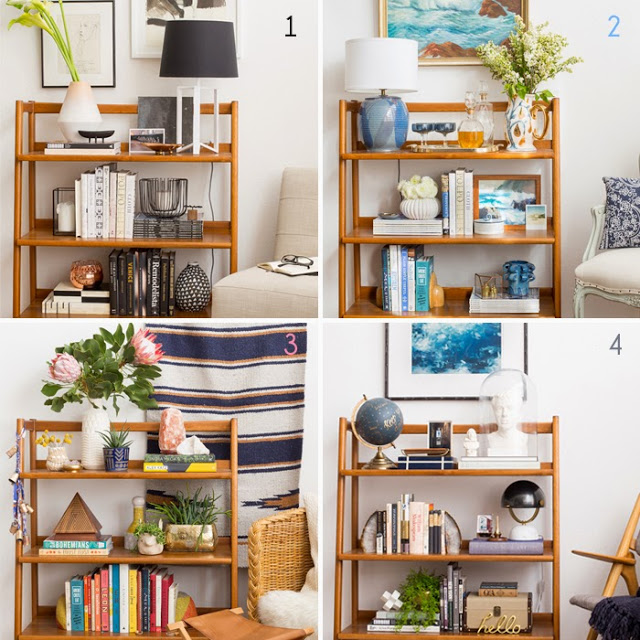
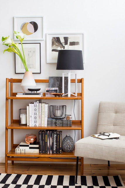
Style: 1 Bookshelf, 4 Ways


According to many design books, my style is The Eclectic Sophisticate (1).  I'll think I have my design style figured out and then I see an amazing room on a blog or magazine and I'm thrown into confusion again.   

Case in point, this fun design challenge by the talented Emily Henderson (stylebyemilyhenderson.com) where she asks her readers to vote for their favorite style of "1 bookshelf, 4 ways." I was surprisingly attracted to the Desert New Age (3).   I love the playful, color-filled, relaxed vibe the style gives off.  I think this version is the new "in" style, even in fashion (hello fringe)d.  I love this style because it can be incredibly affordable - vintage, distressed, used, green, raw.

In the end, I think it's important to know what you are consistently attracted to when styling a home or yourself, it will make you the happiest in the long run.  But I also think it's fun to change it up every now and then and have fun, spaces perfect for this are small bathrooms and bookshelves.  

So after all that rambling, the question I want to ask is which style is your favorite?


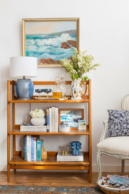
The Desert New Age:

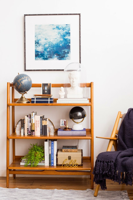
The Playful Scholar:

The Modern Traditional: 

The Eclectic Sophisticate:


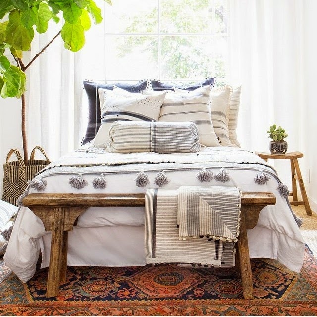
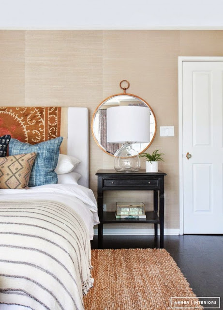
Design Crush: Amber Interiors

{I lovvvvve this bedding she is selling, but definitely can't afford, I'll be looking for something similar though!}

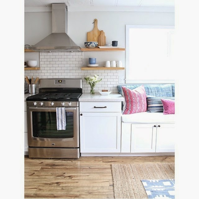
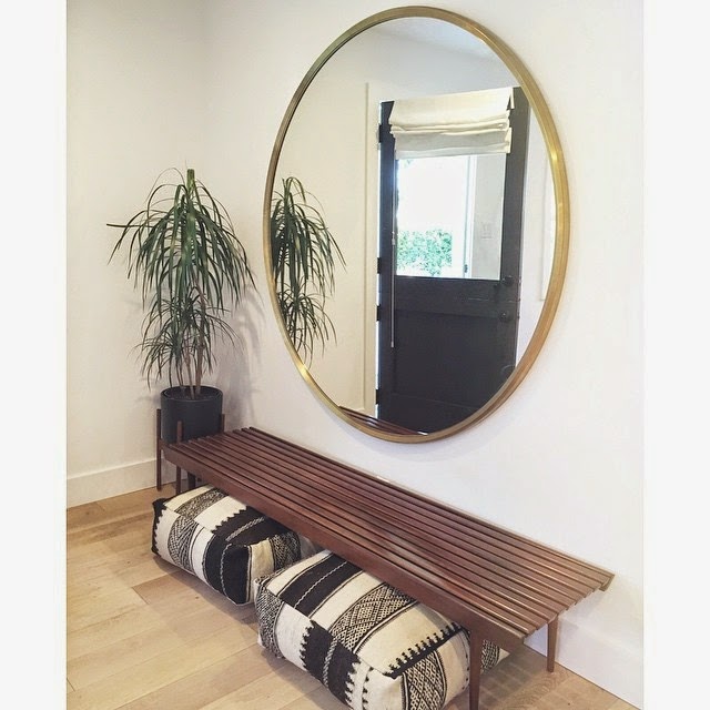
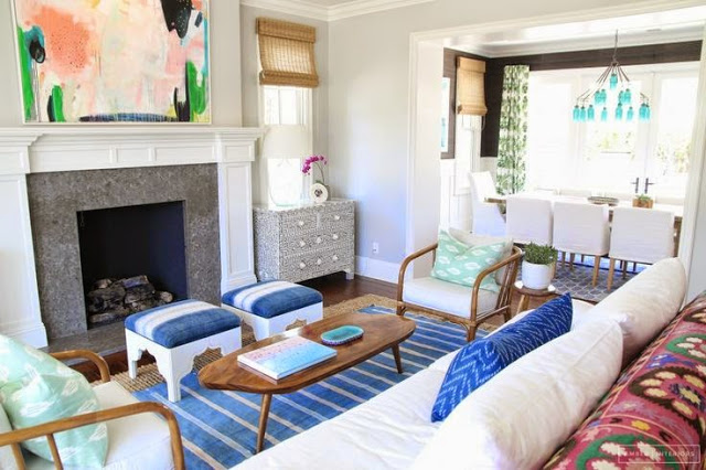
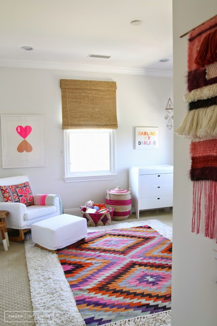
I've recently started following the work of wildly popular interior designer, Amber Lewis of Amber Interiors (amberinteriordesign.com).  I love her consistent use of an all white backdrop, natural wood, green life, and color.  She has the ability to use patterns and bright color but keep the feel of a room clean and airy, a hard balance to achieve for the common folk like myself.  I usually shy away from color or patterns, but Amber has me rethinking my future purchases. 

{I wish I was brave enough to do open, floating shelves in my kitchen}

{this is going in the archives for the entryway in our next house!! I love the oversized round mirror}

{soo much fun for a cottage or a smaller room}

{clean, simple use of different stripes, patterns, and shapes}

{I need to put up some shelves to style}

Below are more pictures of her work that I love:


//all pictures are from her instagram account, pinterest page, and website//

Marshalls for the Win

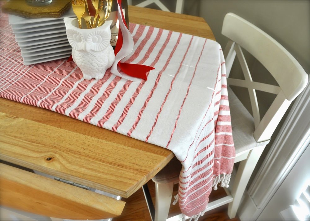
{a striped, light, table runner that will work for a few occasions - Christmas, V-day, July 4th...it was on clearance for $10!}

Marshalls (and TJmaxx, Ross, Tuesday Morning, even Ocean State Job Lot (a northern store which I just experienced last weekend)) can be a hit or a miss.  On Tuesday I considered it a home run! I found things that I had been looking for and actually wanted...I'm not even going to pretend that I needed them.  AND I found them on the cheap cheap cheap.  

Lately I have been really avoiding bringing color in the house.  I've been looking for white, off-white or pale creams.  I'm even tired of taupe or yellow creams (which is the color of my kitchen cabinets at the moment...may change that soon).  Some of the things listed have a little color but it's progress towards an all white, neutral palate I'm headed towards.

Anyways - thought I would share some things that I'm loving in my house right now!

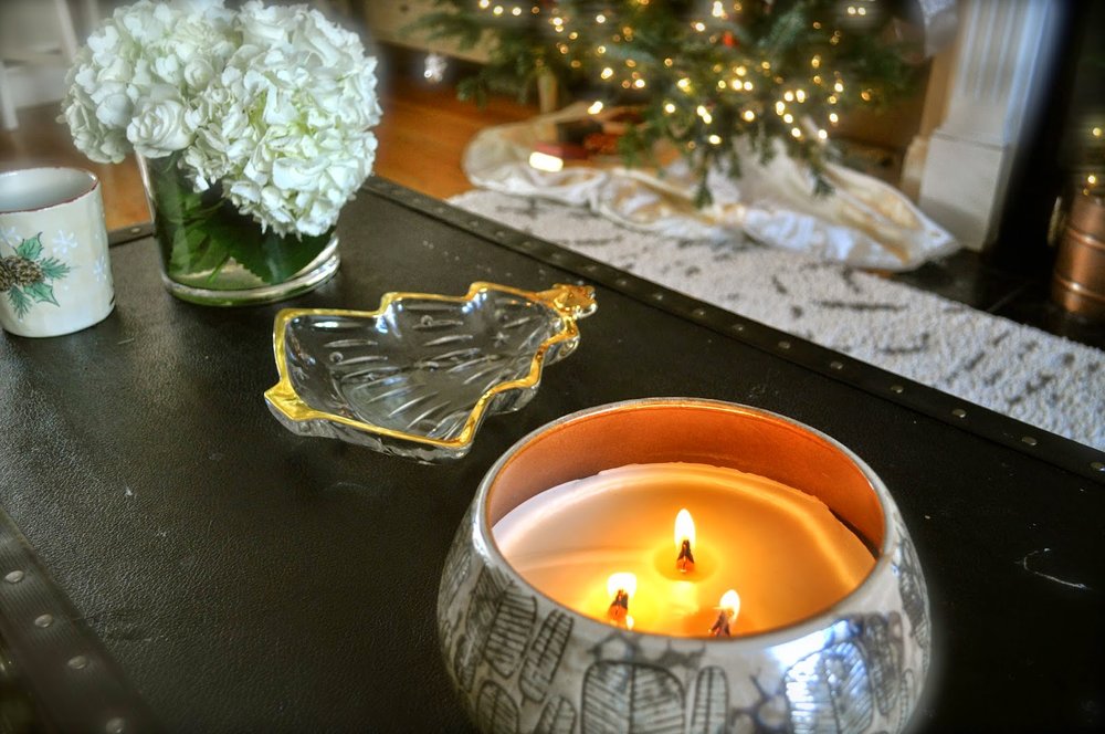
{our fireplace isn't working at the moment so this extra large candles with extra flames does the trick on my coffee table.  I'm also really into all white flower arrangements with pops of red.  And that Christmas tree dish was a thrift store find this summer for a dollar :D }

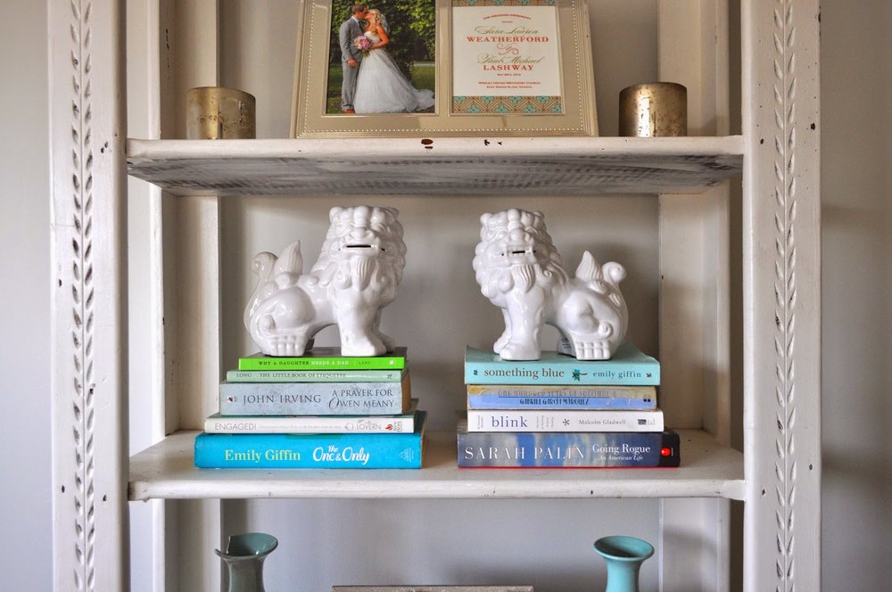
{I was SOOOO excited to find these little guys! and in white! I see them (or something similar) in so many design blogs/magazines.  I can't wait to give them a home on my mantel after the christmas decorations come down.  Only $8 each!}

{This antler piece was on clearance for $10.  Right now it's a bangle/ring holder but I'm sure I'll find more uses for it as time goes on...I even thought about hanging special ornaments on it for a small space Christmas decoration}

A Fall Refresher

First - thank you so much for reaching out to me yesterday.  The facebook comments, messages, and texts really impacted me.  It's scary to put feelings out there, especially in a culture that puts on a perfect front, so thank you for making me feel supported. We are all going through something so we might as well come together and hold each others hands through it.  

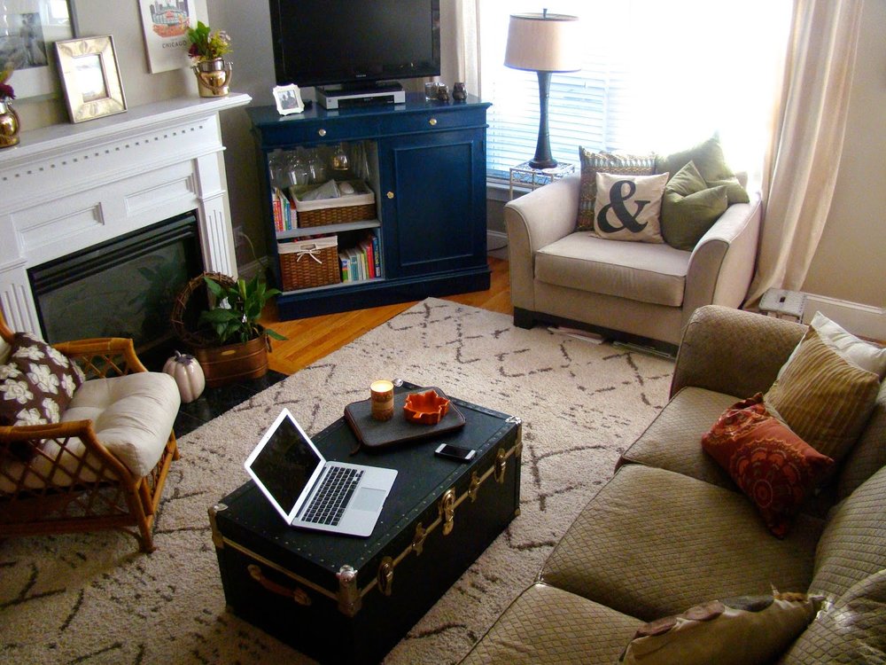
As promised - a little post on a simple Fall update! I love changing the house to match the seasons.  A few weeks ago, on the first day of Fall, I went up to the attic and grabbed my Fall themed throw pillows (I forgot the blankets!) and started from there.  
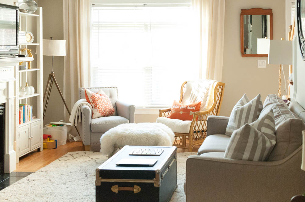
The pictures aren't perfect (argghhhh I need to get my camera fixed!!) but they'll do.  Most of this change-up was free.  I switch curtains and lamps around the house, found throw pillows that I had stored from last year and added just a few Fall accessories.  When you have clean, neutral items and colors in a room, it is easy to transform the room with just a smidge of color.
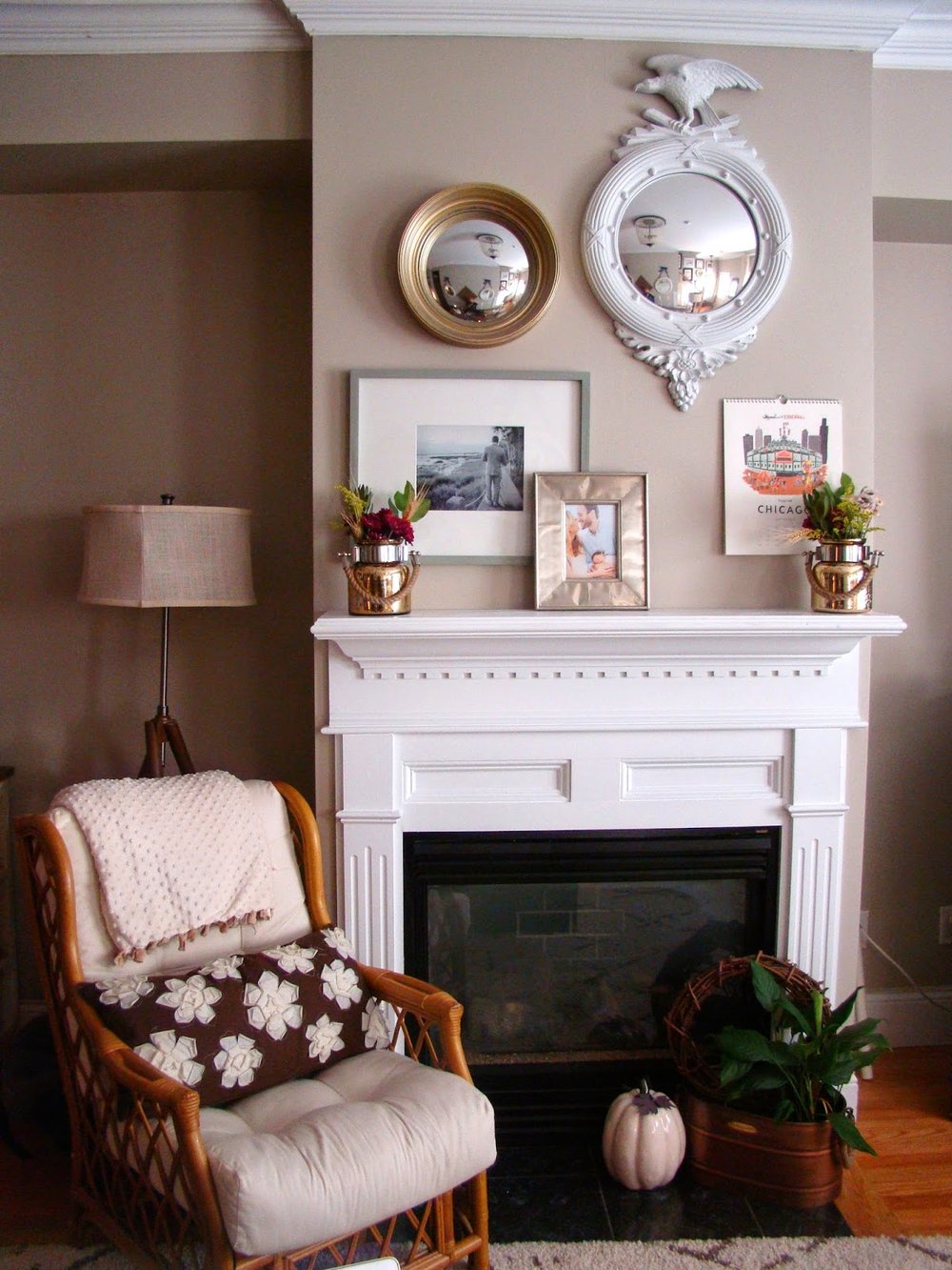
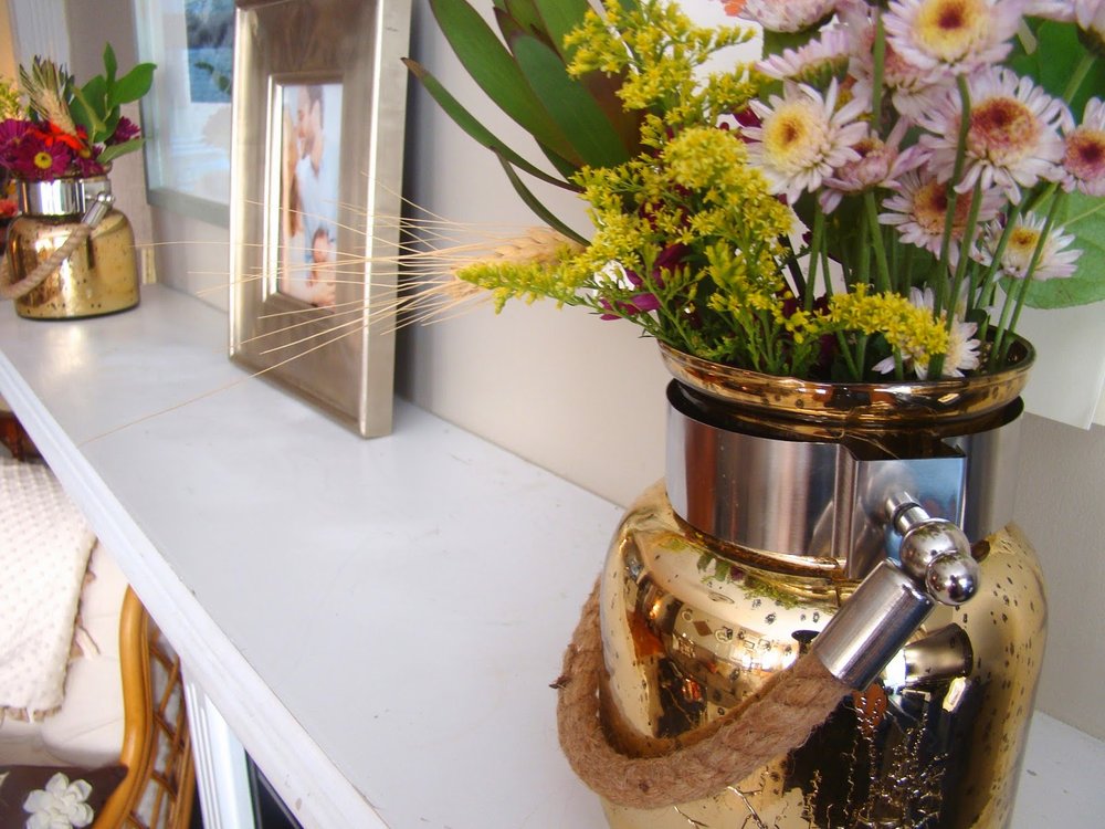
our Fall-ish mantel: 
A brown bolster throw pillow, gold/mercury containers with rope detail and fall colored flowers.  My only plant in the house (still alive!), a ceramic cream pumpkin, and a simple twig wreath.


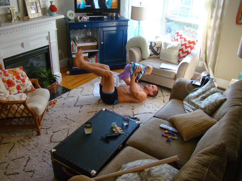
Above: our living room before I did the Fall refresher


The updated room: 
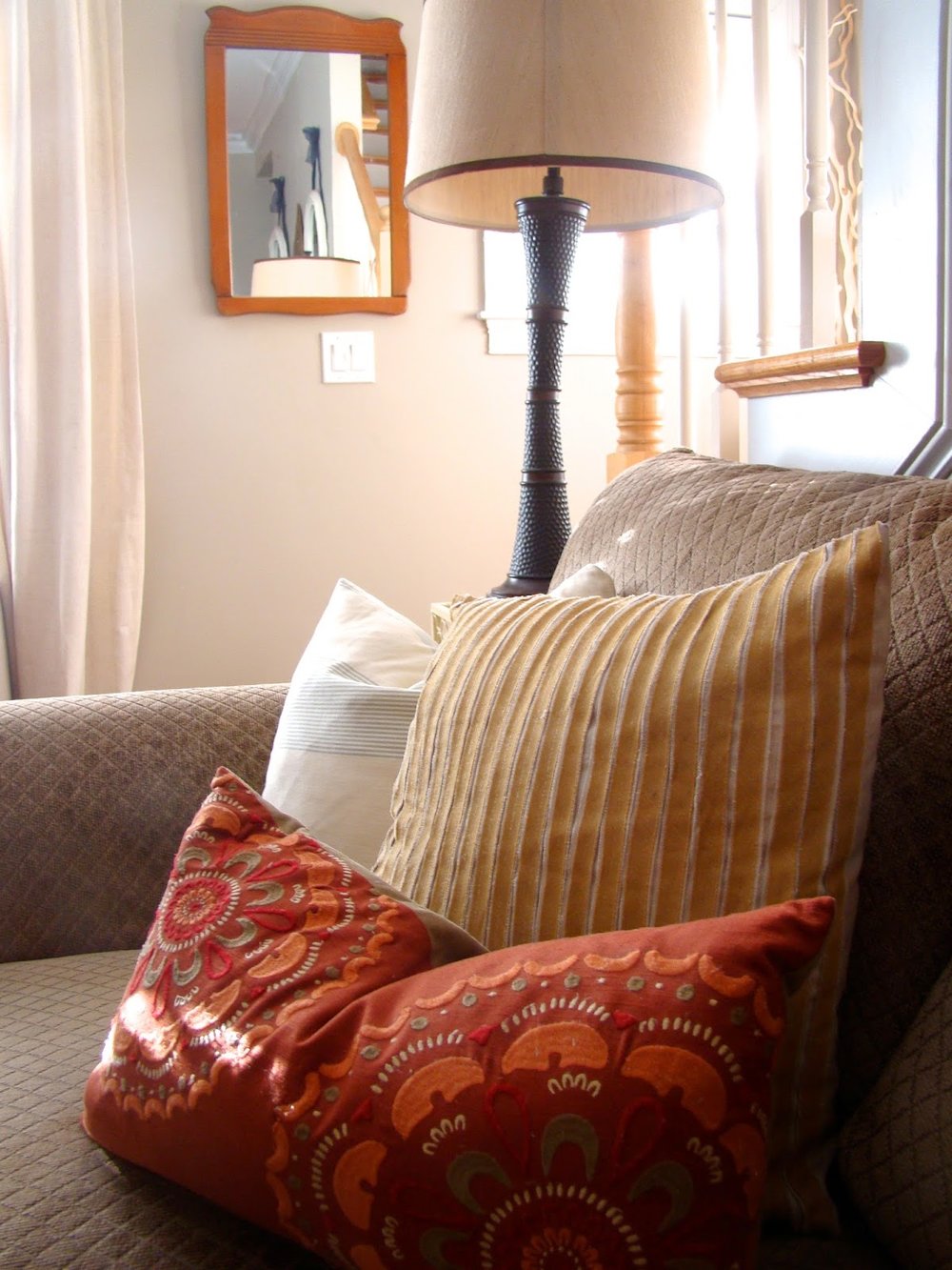
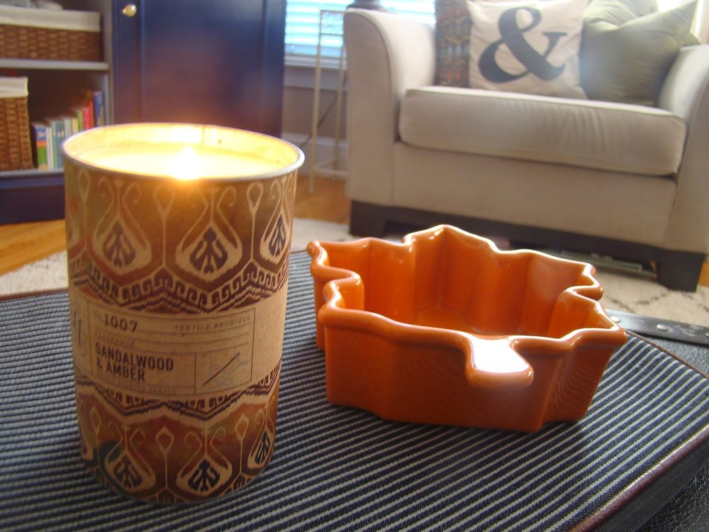
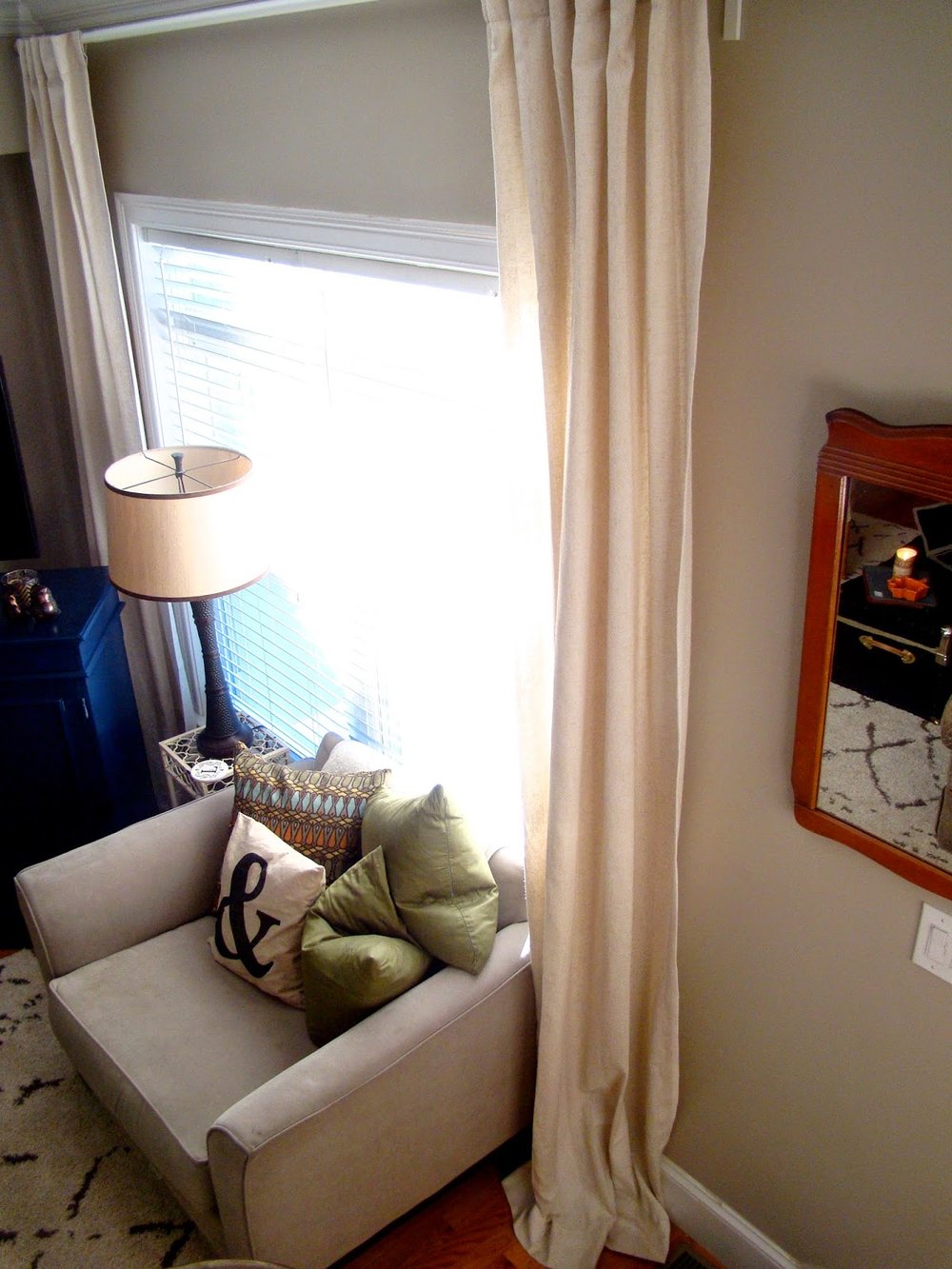
I switched out the curtains from Roswelle's room.  I was sick of the 2yr old polka dot Ikea ones that didn't reach the floor in our living room.  I switched the lamps from our bedroom.  New pillows to add some fall colors.  And the easiest way to change the feel of a room - a scented candle and coffee table accessories.


I'm debating on whether to fill the leaf dish with candy-corn (a personal favorite) or a healthier option such as pistachios... it's still empty 2 weeks later. 


  Curtain advice from my fav blogger Erin Gates of Elements of Style is to hang curtains as close to the ceiling as possible and to have the hem of the curtain gather slightly on the floor.  It draws the eye up, giving the illusion of taller ceilings and adds some drama.  


House Project: Wall Gallery


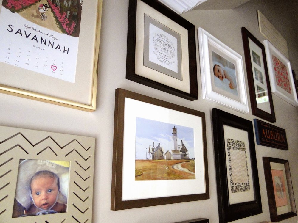
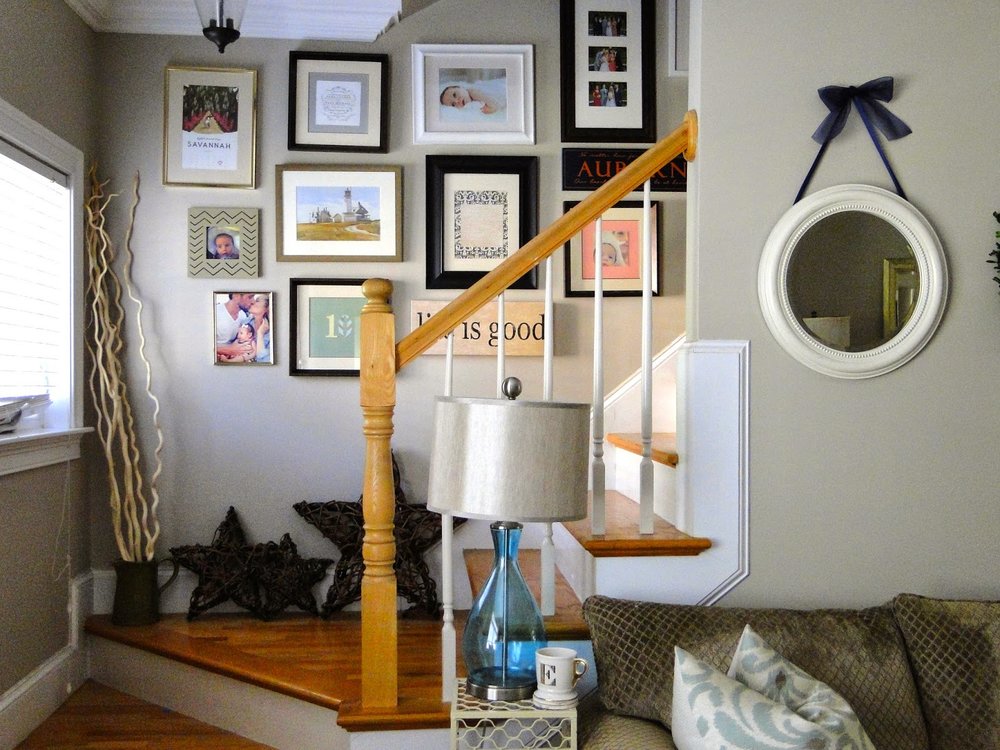
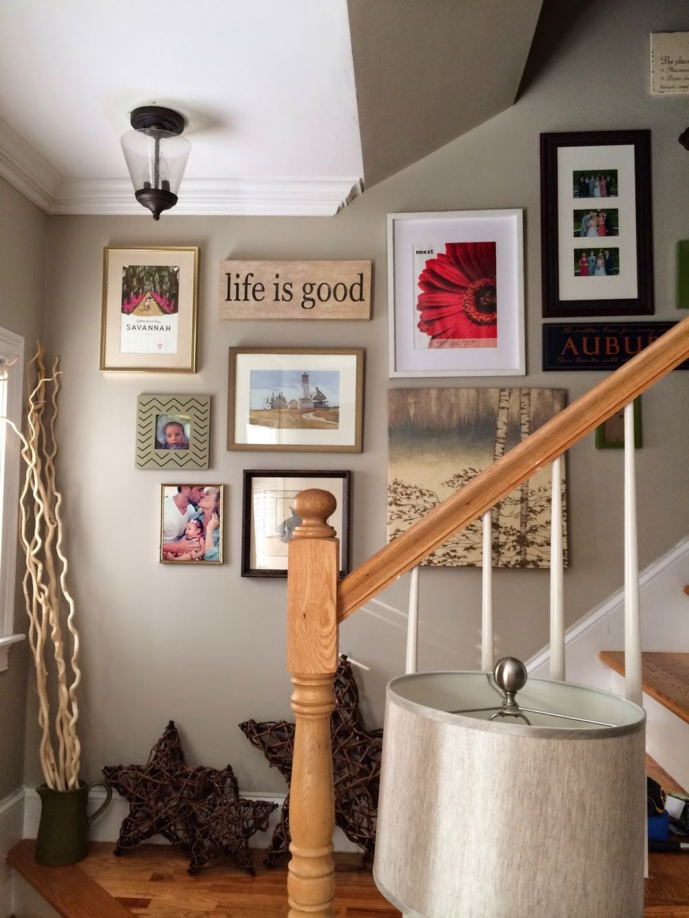
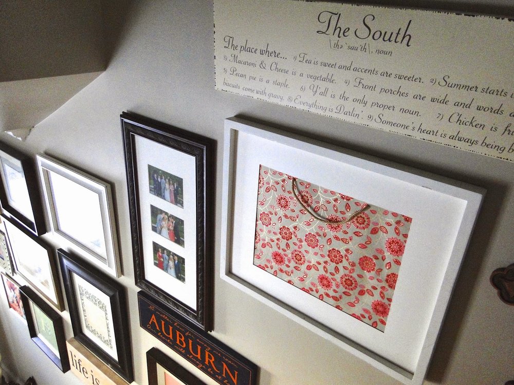
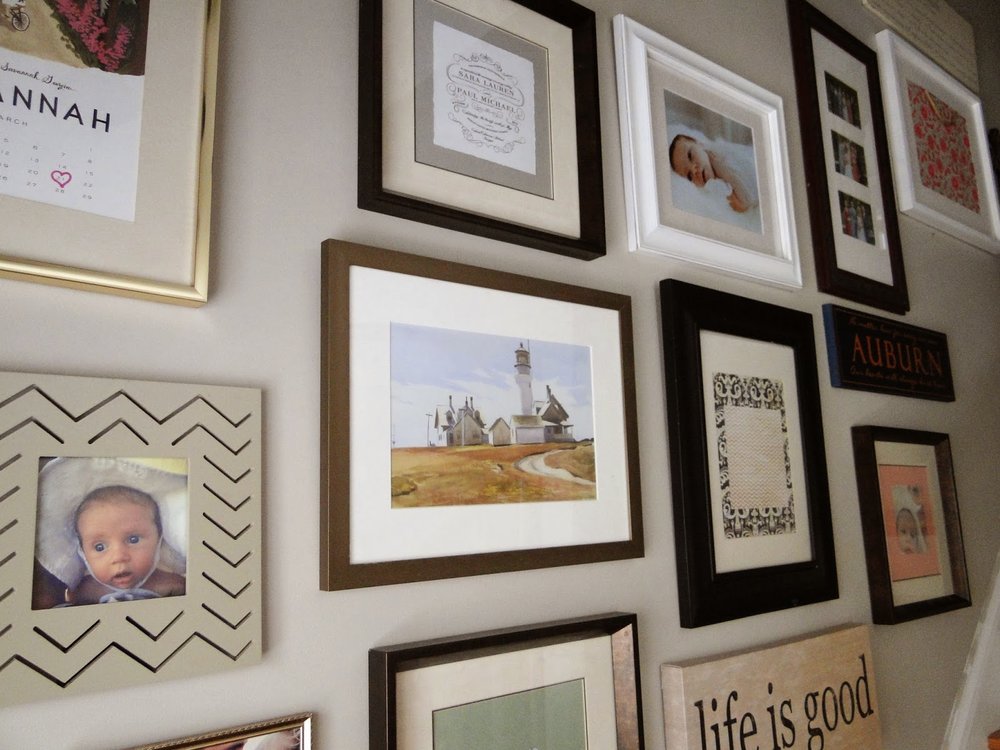
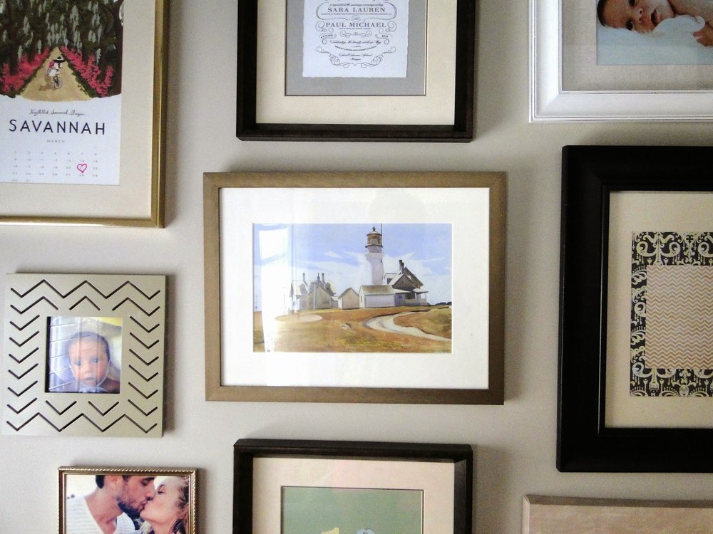
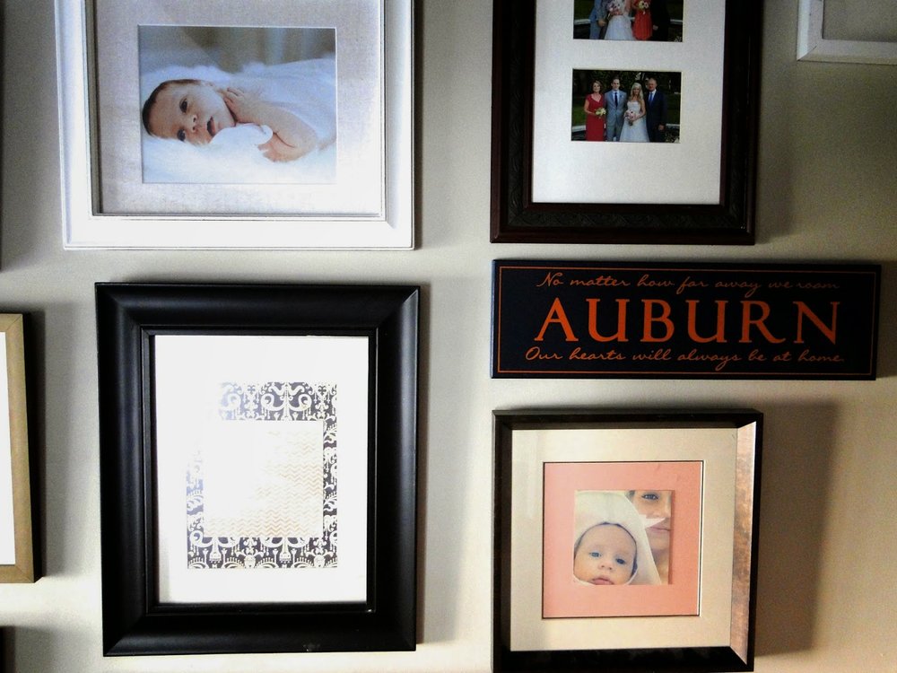
I've been working on this project while Roswelle naps during the day, and oddly enough she is napping as I write this The wall gallery was a work in progress for a couple weeks which I started back when my mom was in town.  I went up into our attic and grabbed any frame I could find; some without a glass pane, some with random art (old purchases from HomeGoods) and some from around the house.  


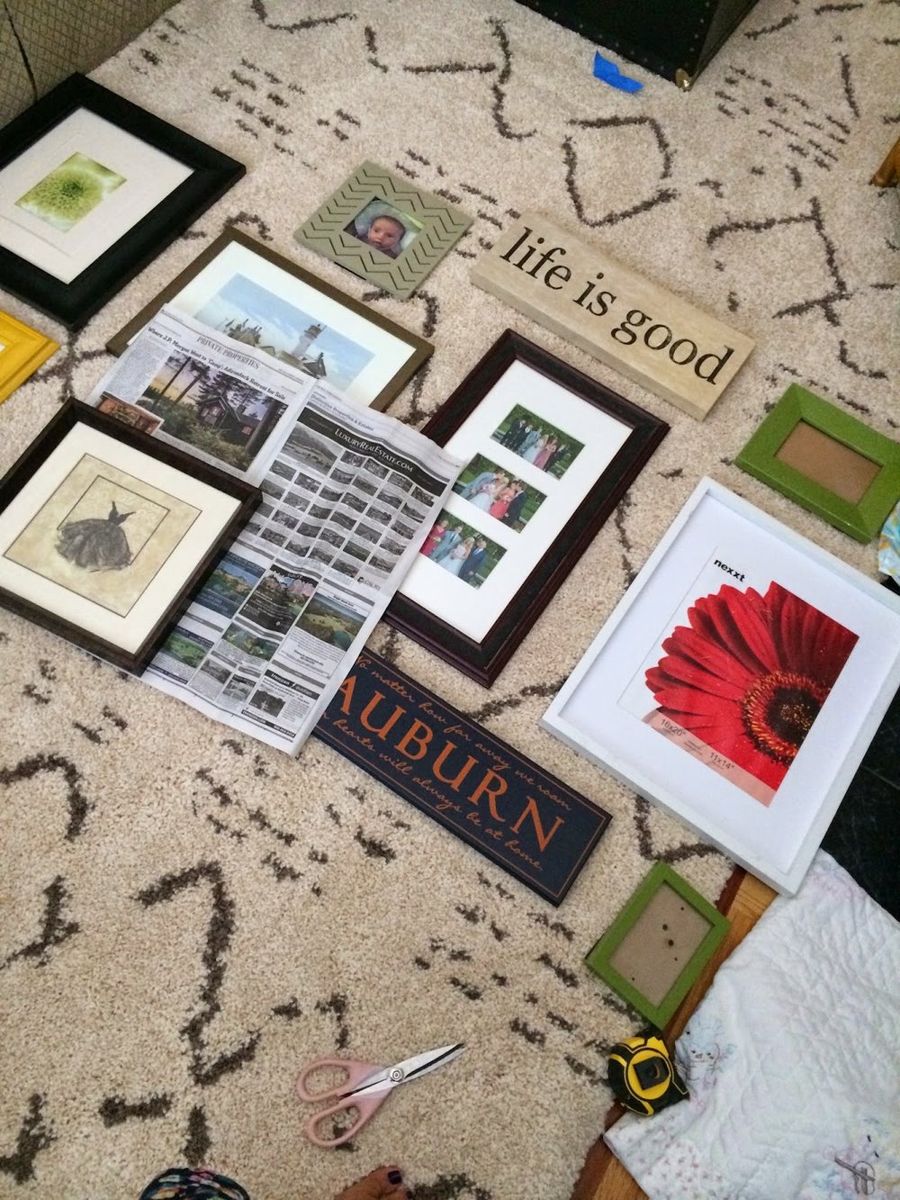
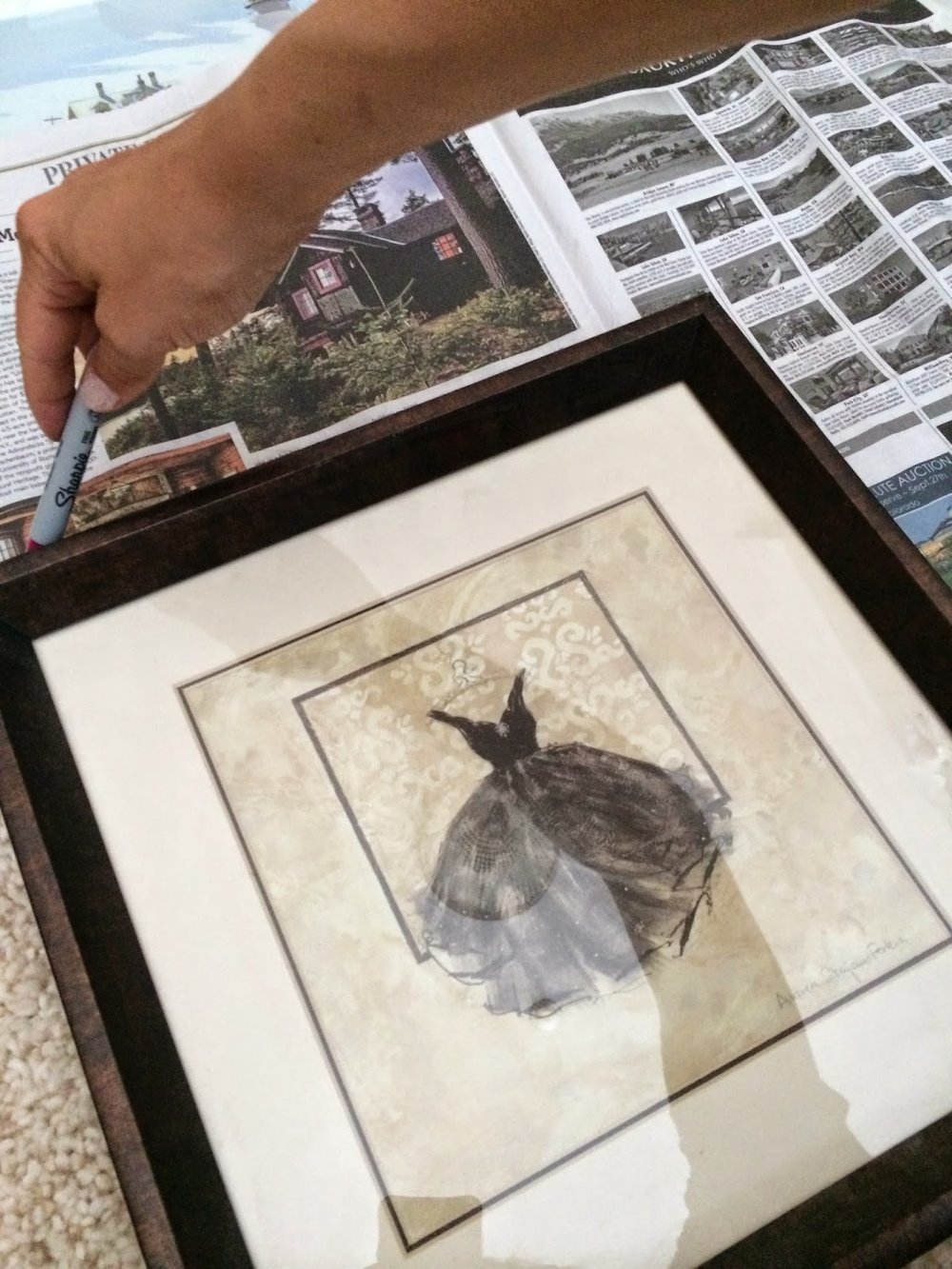
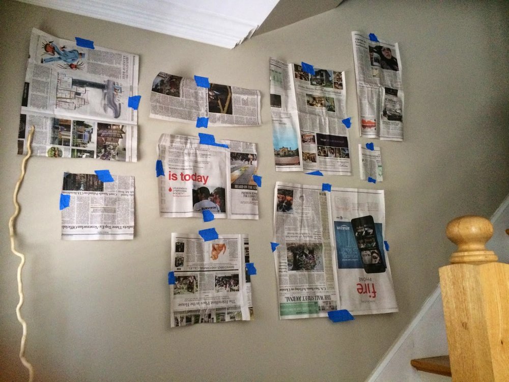
This is how it all started...on my floor.   I spaced out the frames and started tracing them on newspaper.  It seems like an unnecessary step but it only took 10 minutes and helped me visualize the spacing on the wall.


Above is what it looked like for a good week...I was getting comfortable with items on the wall and then started editing and updating which was the fun part. 


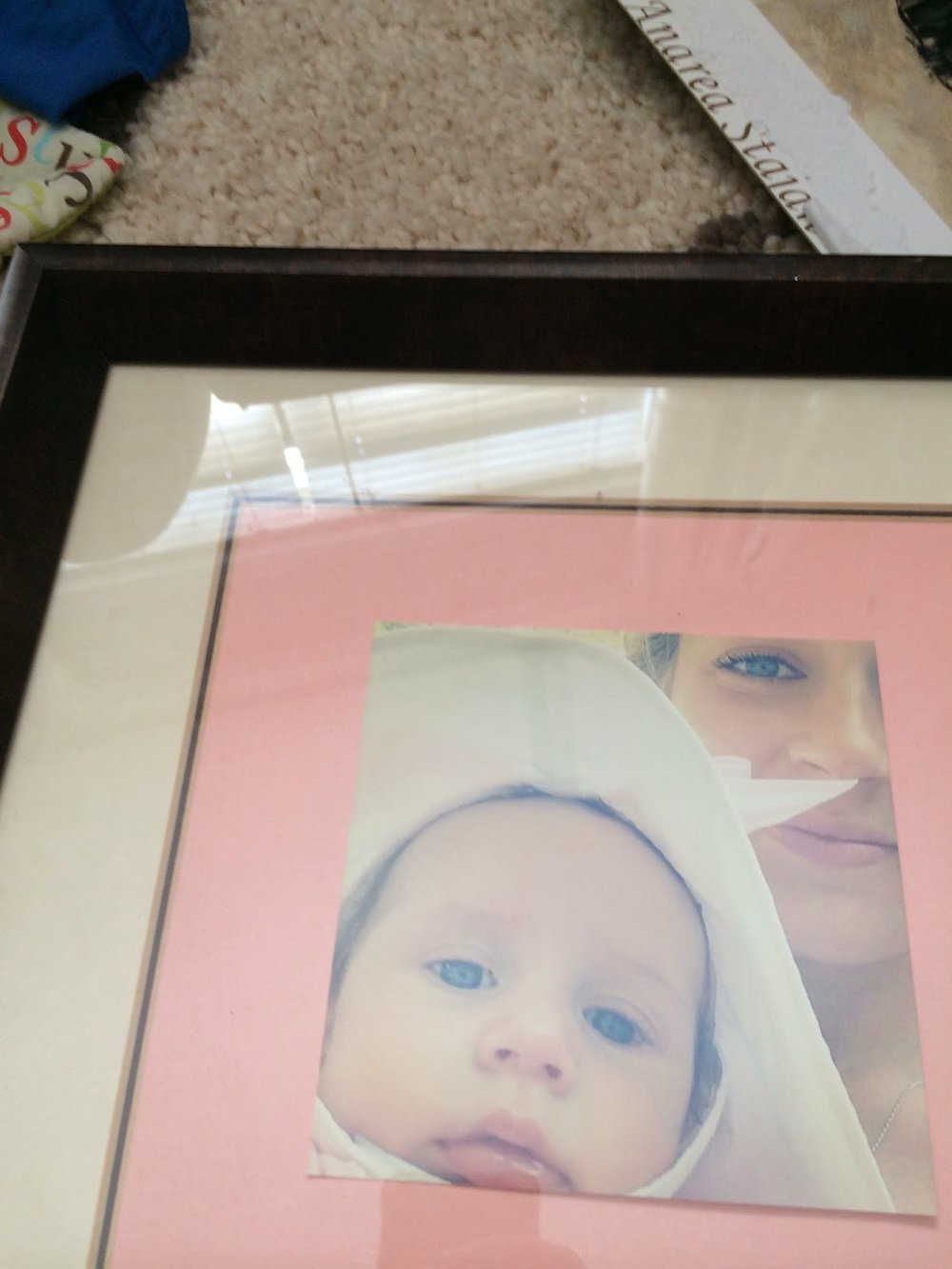
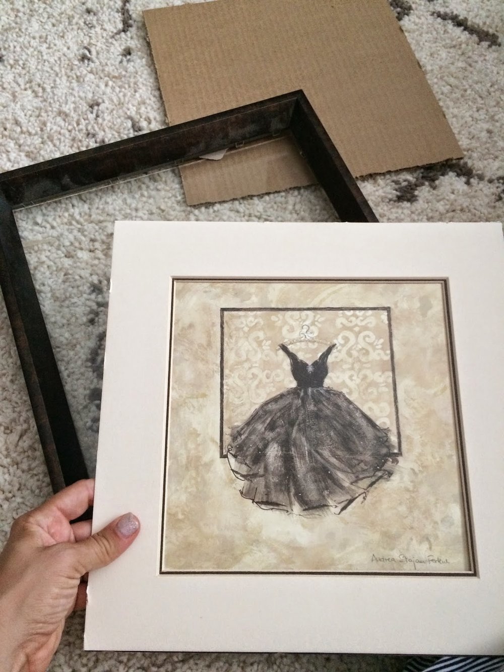
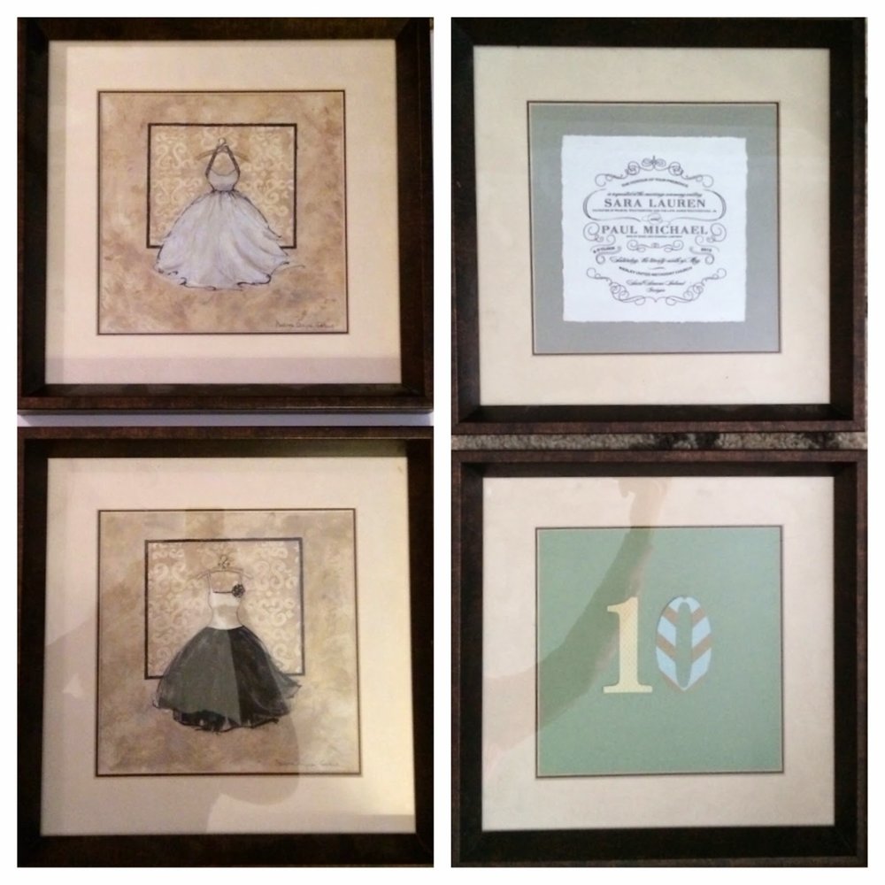
I bought a group 3 framed pictures of dresses for my apartment back when I was 22 and living alone in Atlanta.  They don't fit into my house aesthetic now so I deconstructed them and replaced them with personal items: a recent photo, our wedding invitation and the number 10 which is part of our address now.  I used a lot of scrapbooking items during this whole process - cheap and easy! A 10x10 piece of scrapbook photo fit perfectly in the frame and worked well as a backdrop.


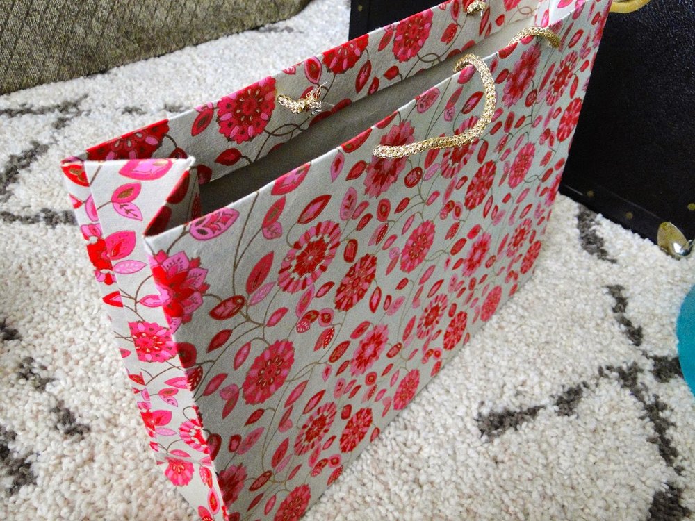
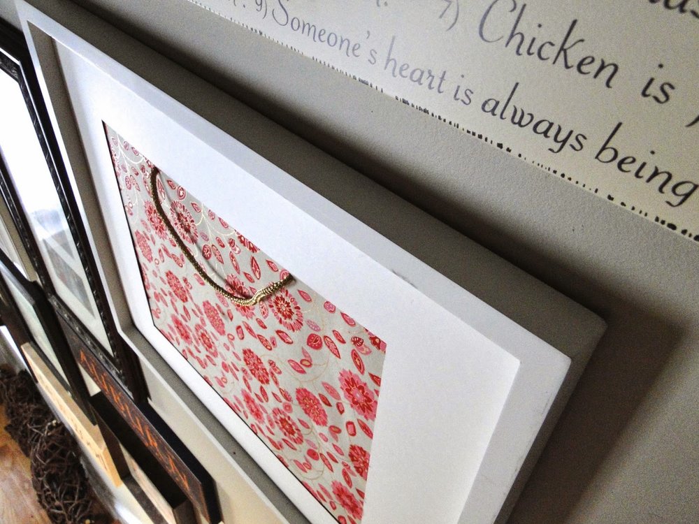
I have always loved this gift bag (from my stylish friend Marcia) and I've been saving it to use as a matte in a frame.  I had the frame pictured below which doesn't have a glass insert (yet) so I cut up the bag and left the handle.  I think it's a fun fit for now.  


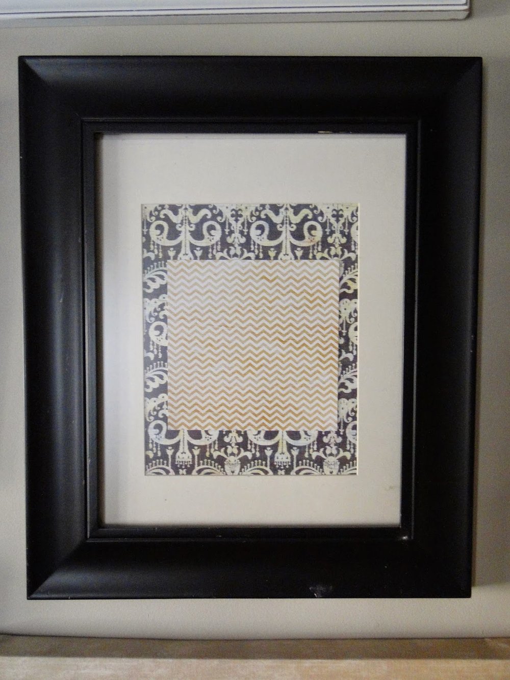
The frame above has come a long way.  I purchased it from Marshalls yearsssss ago.  It didn't have a glass pane and had a random photo of a green flower.  I bought an ugly old picture from a thrift store for $1 that was the same size as this frame.  I used the glass from the thrift store purchase and put scrapbook paper as a filler for now.  Does that make sense? I actually love it.


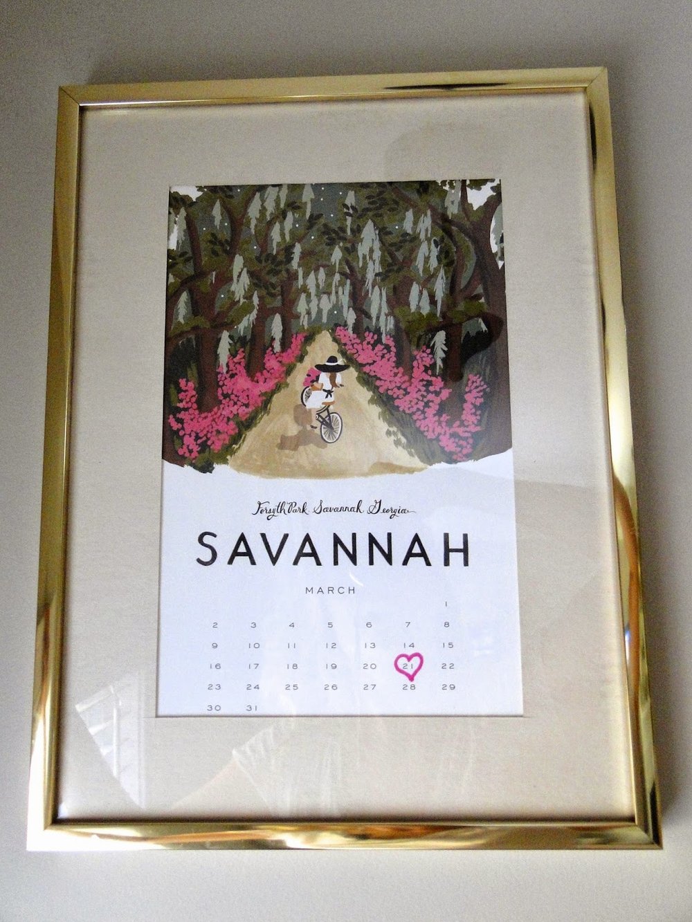
Above is another thrift store find.  It was a great frame for $1 but the cutout is an odd shape - long and slim.  A page from my calendar was the perfect fit.  To make it personal I chose the month of March and drew a heart the 21st with a pink sharpie which signifies Roswelle's birthday.  


I'm really happy with how it looks right now.  I'm not sure if I will go all the way up the wall to the top of the stairs.  I'm sure pictures will change and new frames will be put up. That's the great thing about spackle and paint, you can always change it up!

House Update: New Stove and Rug


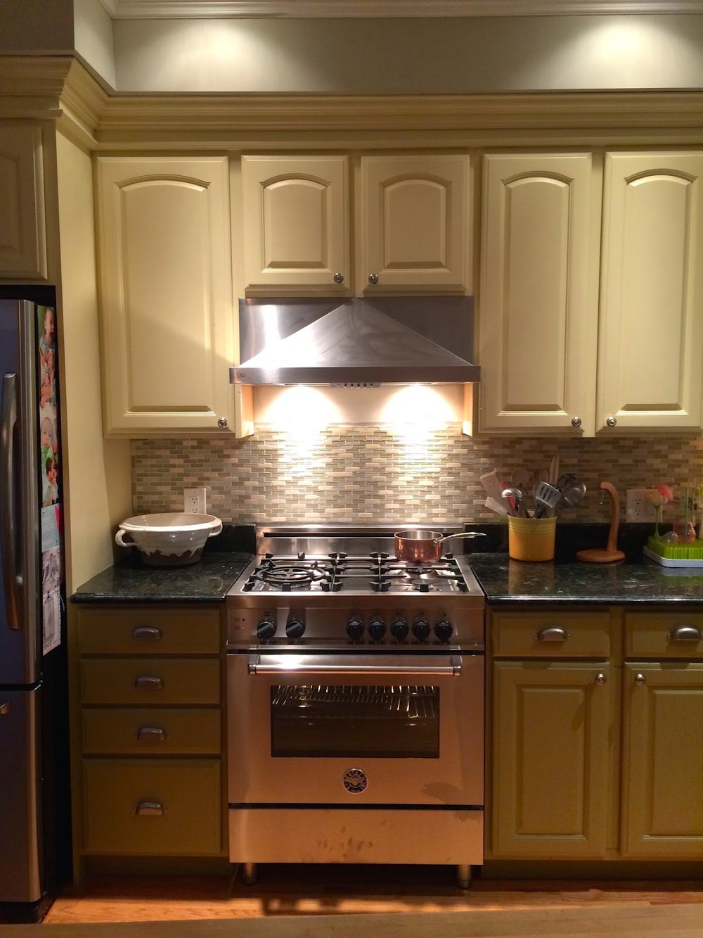
Good news: We got our new stove and hood!! :) *happy dance*
Bad news: my camera's not working right now so these are all iPhone pictures. :/

Our oven had been acting quirky while baking with it - specifically a gas-like odor filling the kitchen.  We had the gas connection checked so we new it was just an old oven issue.  Paul and I also justified the purchase since we knew we would inevitably have to buy a new one before we put the condo up for sale one day, so we might as well enjoy it for a few years. 

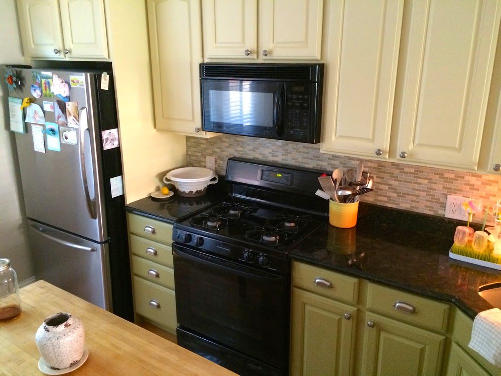
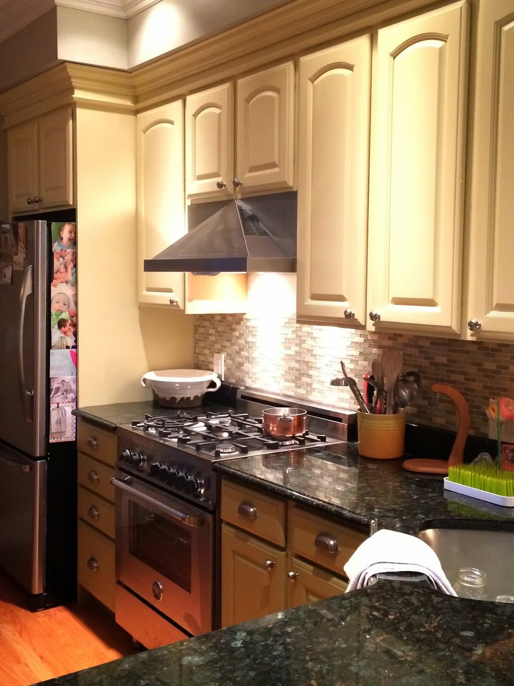
Also - notice what is missing? The microwave!  We got rid of it!!  Paul and I have been avoiding using it for the past couple of months and it was easier than we thought it would be.  1) the hood looks better and 2) natural heat is healthier.  I'm a little nervous about not having a microwave with hungry screaming toddlers but we'll figure that out when we get there.


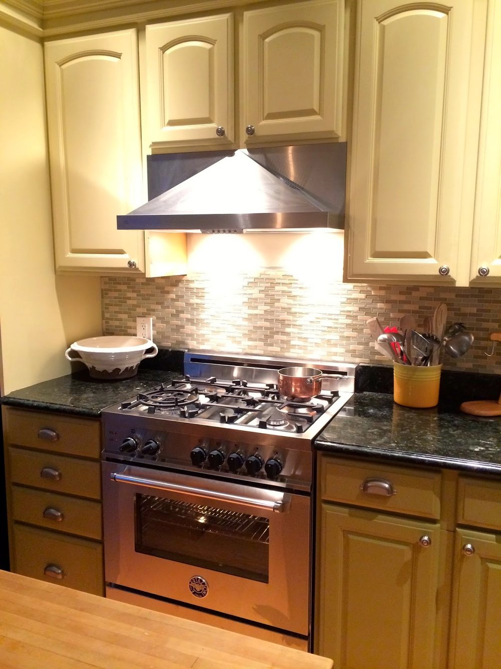
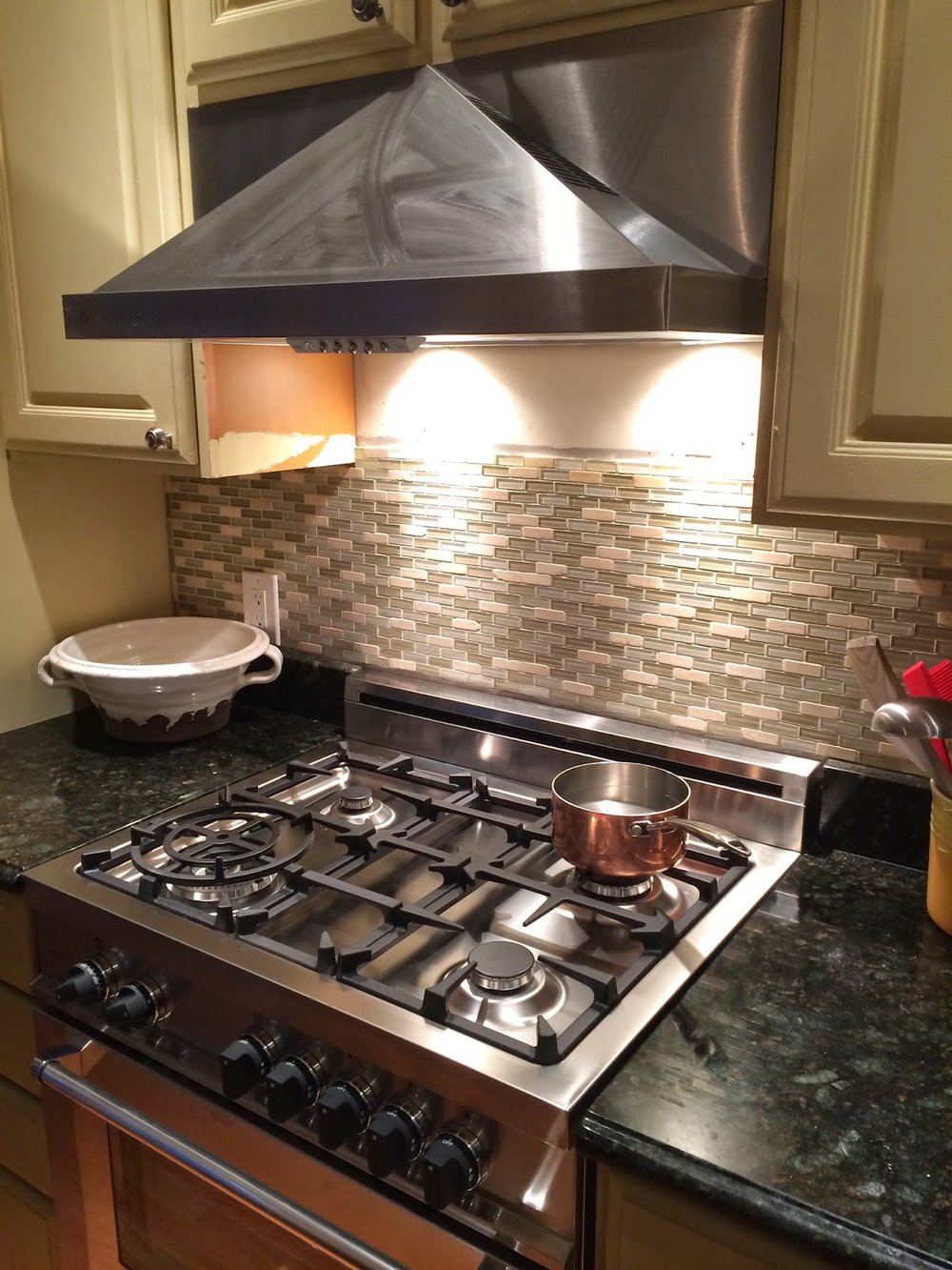
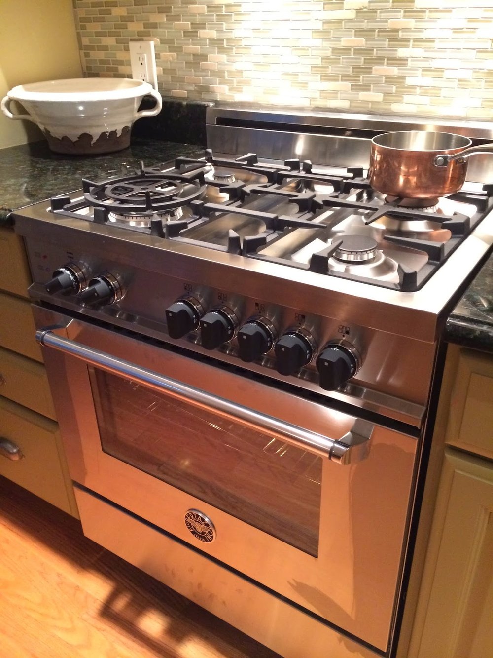
Out with the old...in with the new and improved! I love the lighting from the hood and the way it hits the backsplash.  It is a Bertazzoni range/oven with an XO hood which has the capability to recirculate the air in the room even if it isn't vented to the outside (which ours isn't since we are sandwiched between other townhouses).

A few things bother me about the picture below but I didn't want to wait to post a picture until after they are fixed (because who knows when they will be done - "winter projects"!) 
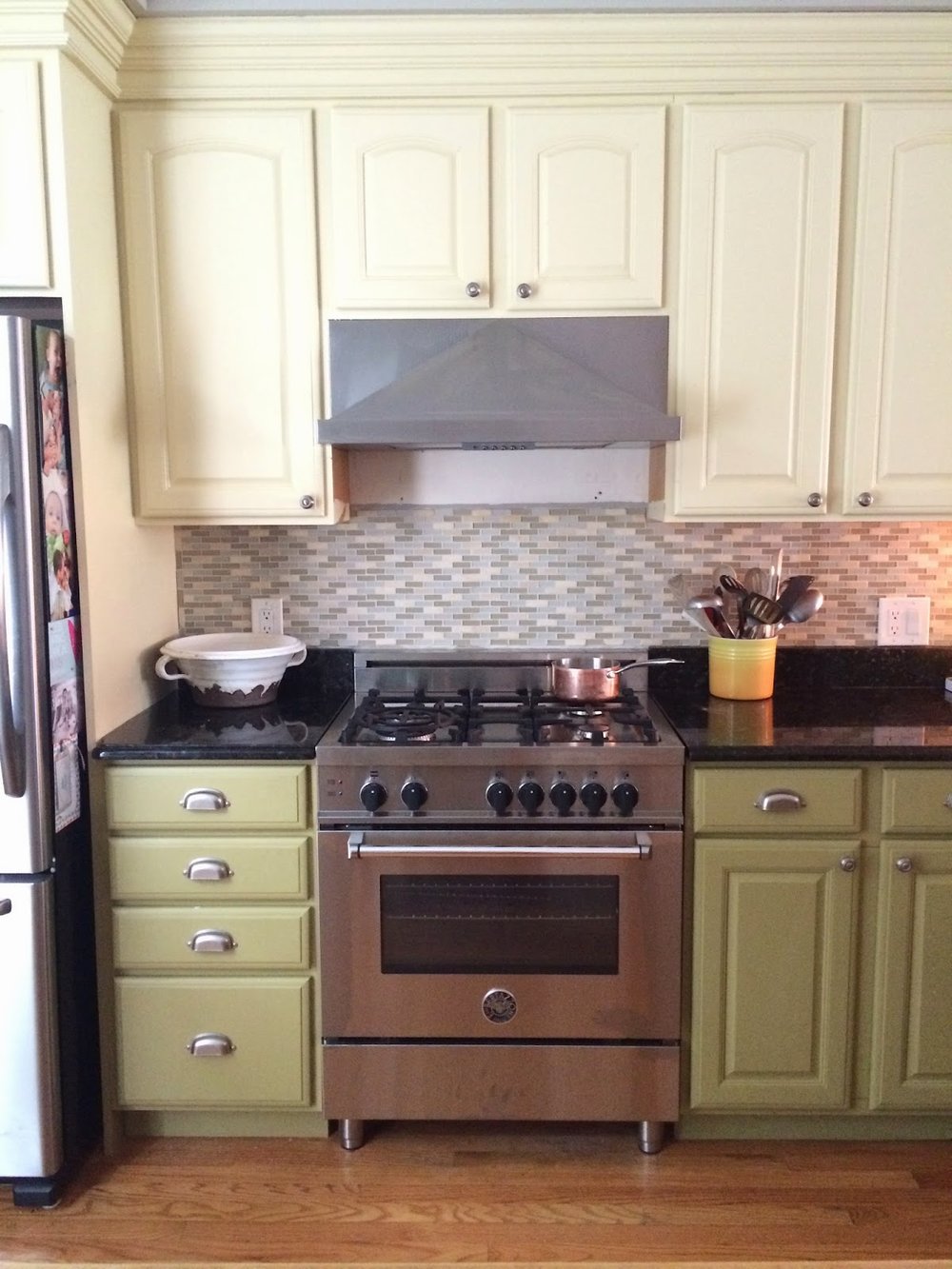
1) the backsplash needs to be filled in to the top - the microwave was 16" in height vs the 11" hood
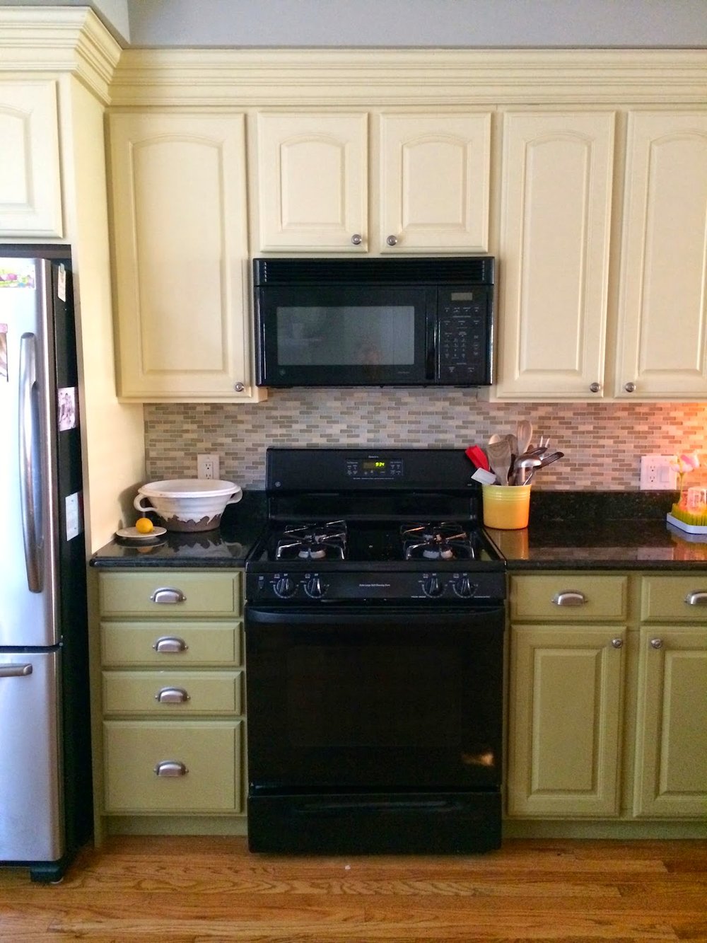
2) the cabinets need to be repainted in general and especially where there is no paint on the side of the cabinets now that the hood is in.  **Future Project alert: I'm planning to repaint all of the cabinets this winter.  It was my first project after we were married and I just wanted to change something in the house asap which meant I didn't do the best job.  The cabinets need better quality paint, a better sand job, and more neutral color...off white? who knows.
3) The fruit bowl isn't full and there are no bananas on the banana hanger for the "after" picture. This bugs me.

{please ignore the fingerprint smudges - going to get some cleaner asap!}


Another change up that happened this week: a new living room rug!  House updates make me more excited than most things...even a new pair of shoes - I swear!  

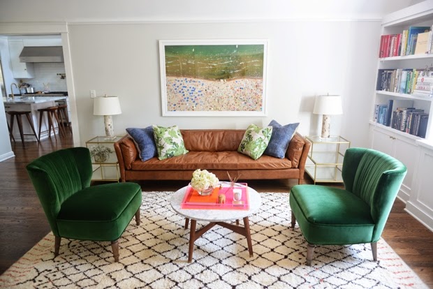
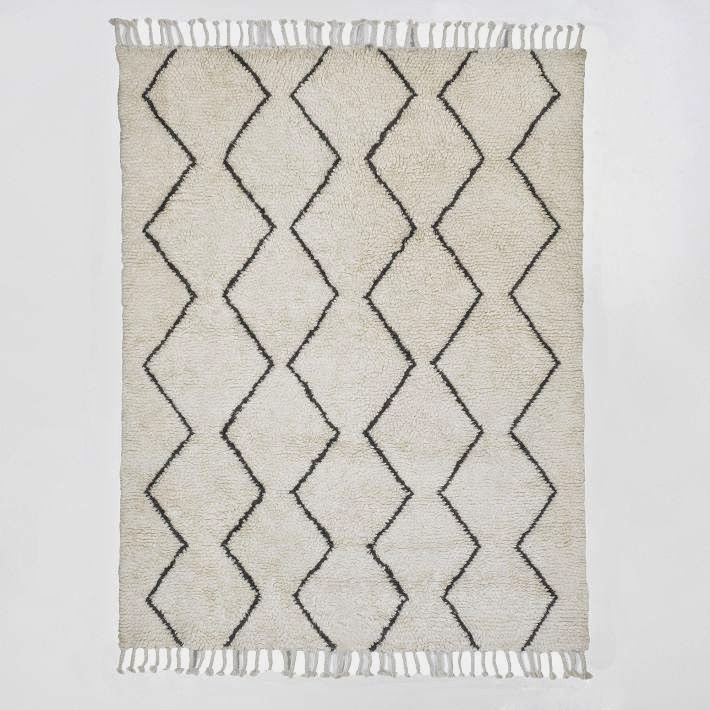
I had been looking for a rug similar to the two below: 


{West Elm Souk Wool Rug - I loveeed this one}

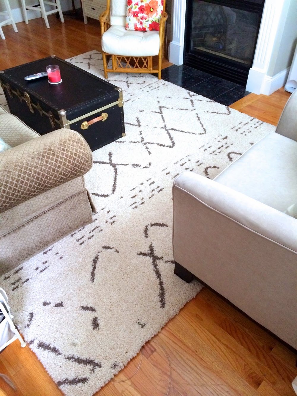
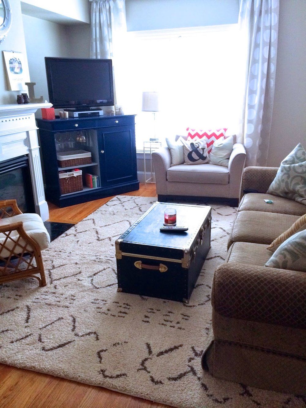
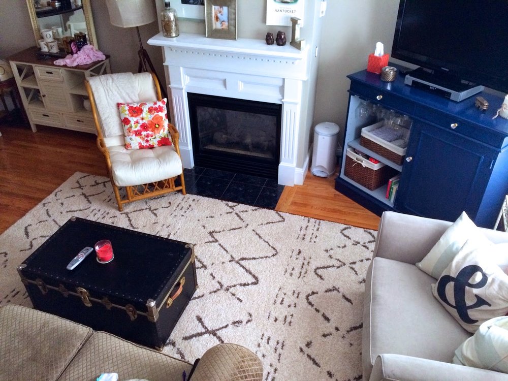
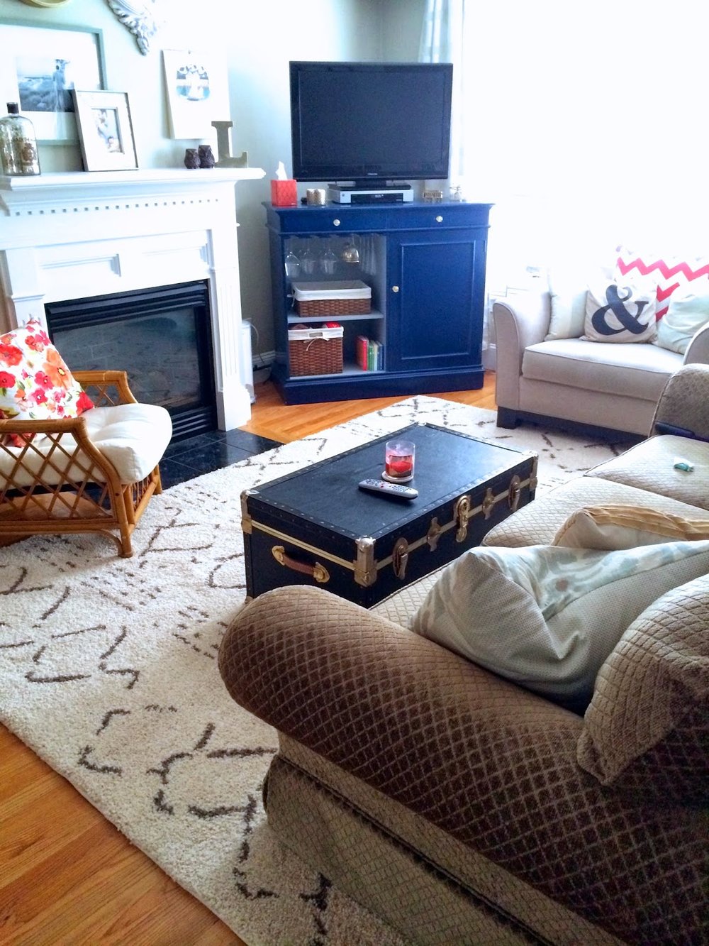
But instead - I found the one pictured below! I found it at HomeGoods in Framingham - I was soooooo excited to find exactly what I was looking for at a price I could actually afford.  

{this picture shows the true lighting the best - remember these are iphone pics}


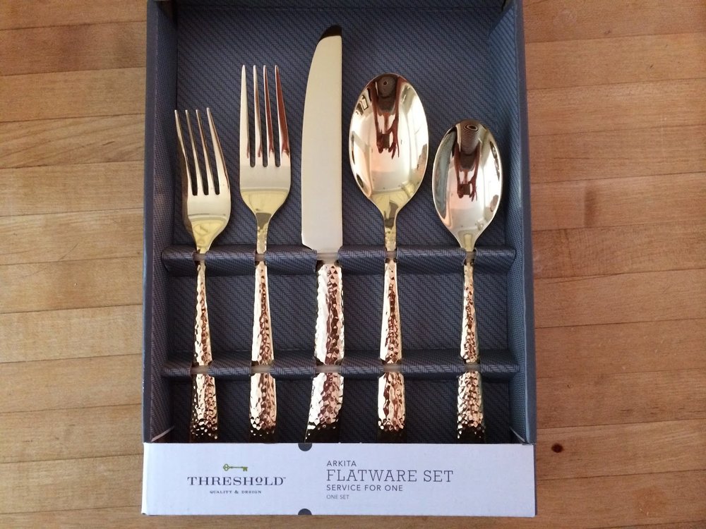
One final exciting thing - I was gifted this gold flatware set from my girlfriends for my birthday.  It's from the Target Threshold line and is super affordable.  I love that Target continues to seriously step it up in at home department.  I can't wait to use these in some food shots :)


Alright - enough blogging.  I need to get the car packed and the house picked up while little peanut is napping.  We are headed to the cape for the weekend again - TGIF!  oh btw - I guess I should let y'all know I am now officially a stay at home momma! or #happyhomemaker.  It's been great so far and something I've always hoped I would be able to do.  I may get the urge to get some part-time work in a few months but for now my days are filled with feedings, diaper changes, swaddles, tummy time, target runs, and walks with the stroller.  

Fall 2013 Favorites

thought it would be fun to do a post things I'm lovin' these days... 

 with nursery planning + new fall items + blogs...I've found plenty to lust after.

Some of these things were already gifted to me, some of them I got a deal on, and some of them are on my dream christmas list (only 55 days left!) 

Fall 2013 Favorites

Have any of you every used polyvore?  I love it.  You can clip items from any site to your library and make inspiration boards from there.  I used it for my wedding, nursery (to be revealed soon), and this! 


1. Johnnie Boden Embellished Ballet Flats - love at first sight!
2. Sheep Skin Rug - can't wait to use this in the nursery...and then eventually over a chair.
3. Copper Tea Kettle - been wanting this for a while...found it on Joss&Main for $35 (now sold out) - but this overstock price is way better compared to most I've seen.
4. Empire Rocker - my dream rocker
5. PB Tuscan Urn - how pretty would mums be in this?
6. Target Pave Bracelet - similar to the J Crew bracelet - but only $20 bucks!
7. H&M Knitted Sweater - I can't seem to have too many cream sweaters...
8. W&S Spiced Chestnut Collection - W&S figured out a way to put Autumn in a bottle (great gift!)
9. J Crew Maternity Pants - did anyone else know jcrew has a maternity line?? My uniform could be skinny colored pants and a sweater top - wear it every day - so these would be perfect